There is a very specific type of chaos that happens when it rains for three days straight. You run out of snacks and patience simultaneously. That is exactly why I forced myself to sit down and map out these SpongeBob coloring pages with the illustrators.
I needed something loud and distracting to keep the kids from tearing down the living room curtains. Sometimes you just have to lean into the nautical nonsense.
Printing these off buys me roughly 42 minutes of uninterrupted silence. Or rather it reduces the screaming to a manageable hum.
You can just grab whichever printable SpongeBob coloring pages they want right from the grid. Stock up on yellow crayons because they will absolutely demolish them by tomorrow.
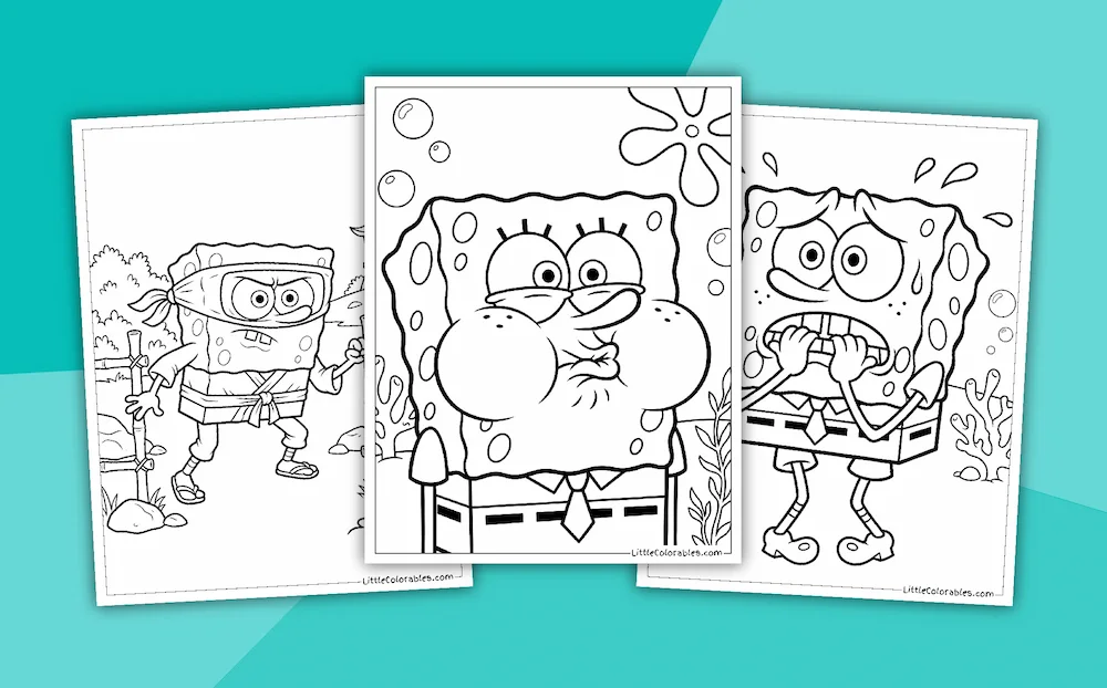
SpongeBob Character Coloring Page Collections
Featured SpongeBob Coloring Pages
SpongeBob Coloring Page Highlights
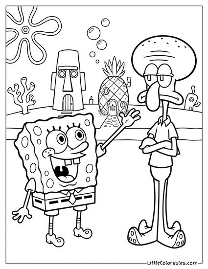
Giving a High-Five to Squidward
SpongeBob is cheerfully trying to high-five his neighbor while Squidward just stands there with his arms crossed. The contrast between their expressions is honestly hilarious.
My son always colors Squidward a sickly green instead of blue. It is one of those free SpongeBob coloring pages that works perfectly for talking about grumpy moods.
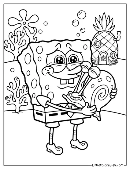
Hugging Gary the Snail Tight
He is squeezing Gary so hard here that the poor snail’s eyes are bulging out. The pineapple house is sitting quietly in the background.
You need some bright pinks and greens for Gary’s shell. A good SpongeBob coloring sheet always includes his favorite pet.
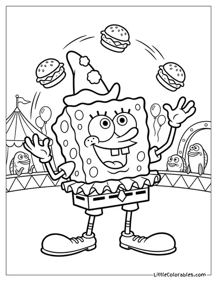
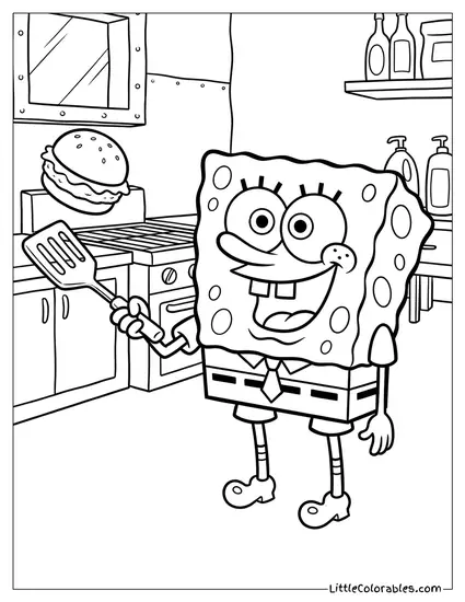
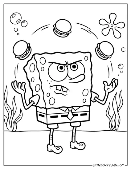
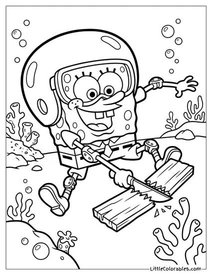
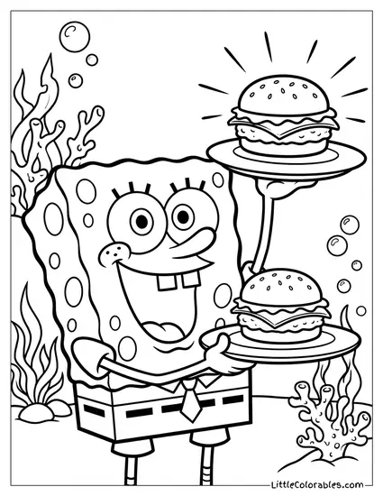
Juggling Three Krabby Patties
He looks incredibly intense while juggling these burgers underwater. His face is all scrunched up in deep concentration.
There are little bubbles floating up around the food. Providing SpongeBob coloring pages for kids like this usually ends up making everyone hungry for lunch.
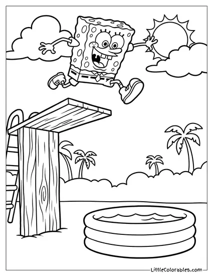
Jumping off a Diving Board
SpongeBob is leaping off a high wooden diving board into a ridiculously tiny inflatable pool. He looks completely thrilled about the terrible physics of this situation.
The palm trees in the background give it that classic Bikini Bottom feel. Finding printable SpongeBob coloring pages with funny visual gags is always a priority for us.
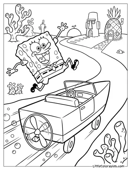
Dodging a Speeding Boatmobile
He is frantically jumping out of the way of a boatmobile speeding down the road. You can almost hear the screeching tires.
Kids can use a lot of greys and silvers for the boat engine. These SpongeBob SquarePants coloring pages are great for adding motion lines with colored pencils.
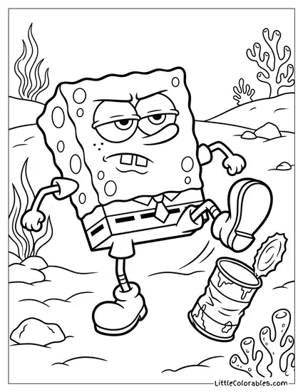
Nervously Biting His Fingernails
Poor guy is sweating buckets and chewing on his fingers in total panic. It is a very relatable mood when you realize it is Monday morning.
The coral reefs around him are pretty detailed. Handing them a SpongeBob coloring sheet with lots of background elements keeps them busy longer.
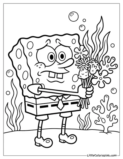
Offering a Bouquet of Sea-Flowers
He is holding out this weird bouquet of underwater plants with a hopeful little smile. It is surprisingly sweet for such a chaotic cartoon.
My daughter loves trying to invent new colors for the alien-looking flowers. This is one of those free SpongeBob coloring pages that lets them get creative with the flora.
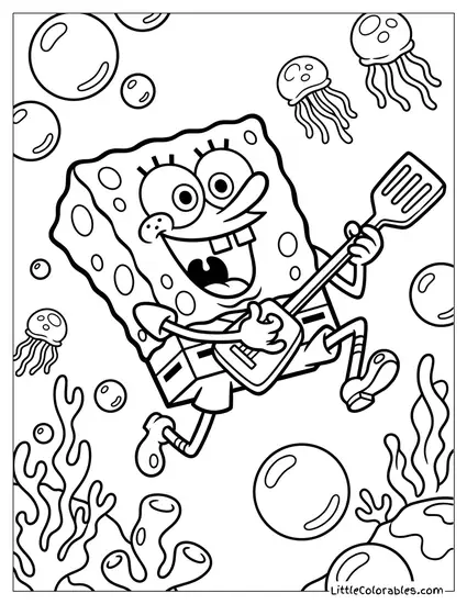
Performing a Spatula Guitar Solo
SpongeBob is rocking out mid-air using his spatula like an electric guitar. There are jellyfish floating all around him while he shreds.
The energy here is just off the charts. Watching them tackle SpongeBob coloring pages for kids with this much detail is genuinely fun.
Tips for Coloring SpongeBob Coloring Sheets
1. The Right Yellow
You cannot just grab the first yellow crayon you see and expect it to look right. SpongeBob has a very specific neon sponge color that borders on green if the lighting is bad. I usually tell my kids to put down a layer of pale yellow first. Then lightly go over it with a brighter sunshine yellow to make it pop.
If they press too hard with a dark mustard color he ends up looking dirty. And what follows from this? A meltdown because he does not look like the TV show. Keep the pressure light and build the color slowly.
2. The Sponge Holes
His sponge holes are usually a darker olive green or brown color. Most kids just leave them white or color them the exact same yellow as his body. This completely flattens out his texture. Try using a dull khaki or a very light brown for those little circles.
It gives him actual depth. It is exactly like shading craters on the moon… just underwater. This little trick makes these printable SpongeBob coloring pages look significantly more professional. Will this work tomorrow? No idea. But today it prevents flat artwork.
3. The Ocean Backgrounds
Bikini Bottom is not just a flat blue void. The water has a lot of green and turquoise mixed into it depending on the scene. Encourage your kids to mix a little lime green into the sky blue for the background. It creates that murky but bright tropical water feel.
Leaving the background completely white makes him look like he is floating in space. It is, let’s say, not the best look. Or rather it is a missed opportunity. All this color theory comes down to one thing: fill the blank space with weird blues.
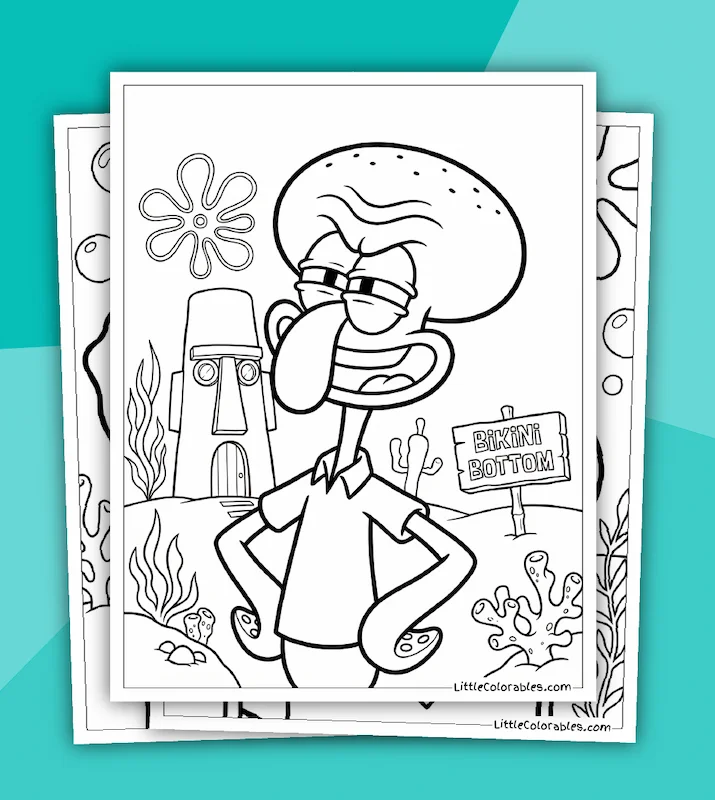
4. Squidward’s Skin Tone
If you are coloring a scene with his grumpy neighbor you have to get the skin tone right. Squidward is a very difficult shade of greyish green-blue. Using a standard sky blue crayon makes him look way too happy. You need a turquoise mixed with a little bit of grey.
It might cause some inconvenience trying to find that exact shade in a box of 24 crayons. Honestly we just layer light blue and light green together. These SpongeBob SquarePants coloring pages demand a little bit of color mixing to get the characters accurate. It is worth the extra effort.
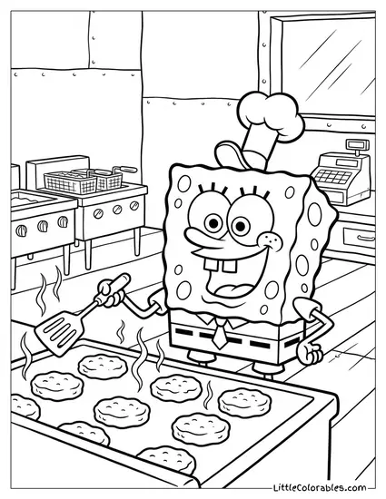
5. The Krusty Krab Uniform
When he is wearing his little Krusty Krab hat you have to nail the tiny details. The anchor on the hat is a tiny blue speck that requires a very sharp pencil. Do not let them just smear blue crayon over the whole hat. The white brim is essential for contrast against his yellow head.
His tie is a sharp bold red. It is the only warm color on his outfit besides his skin. Make sure they press hard on that red tie so it stands out against the crisp white shirt. It anchors his whole weird square design beautifully.
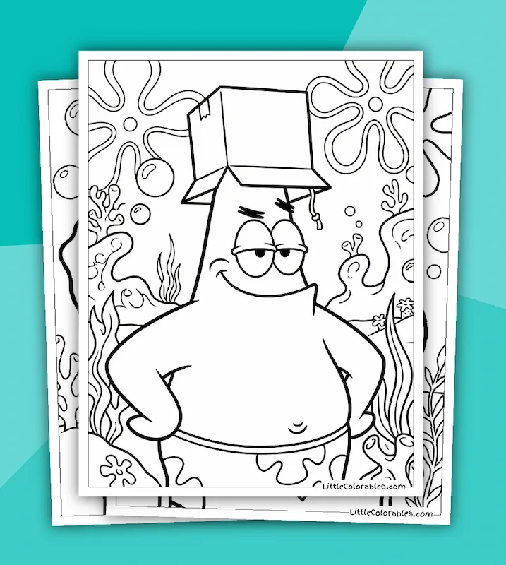
6. Patrick’s Pink Paradox
Even though Patrick is not the main focus he shows up a lot in the series. He is a very specific shade of coral pink. A hot neon pink makes him look radioactive. You want a softer salmon or peach color to get that authentic starfish look.
His shorts are another trap entirely. The purple flowers on the neon green background clash terribly if you don’t use the brightest markers you own. I don’t have an exact answer here for avoiding muddy colors. Just tell them to color the purple stars first before filling in the green space.