


Kids have this weird obsession with things that float. Mine just stared at a muddy puddle for like 17-18 minutes yesterday.
I think it’s the magic of it all. . . how something so pretty grows right out of the muck. We sketched out these lotus coloring pages to capture that exact feeling. Grab your crayons and let’s get into it.
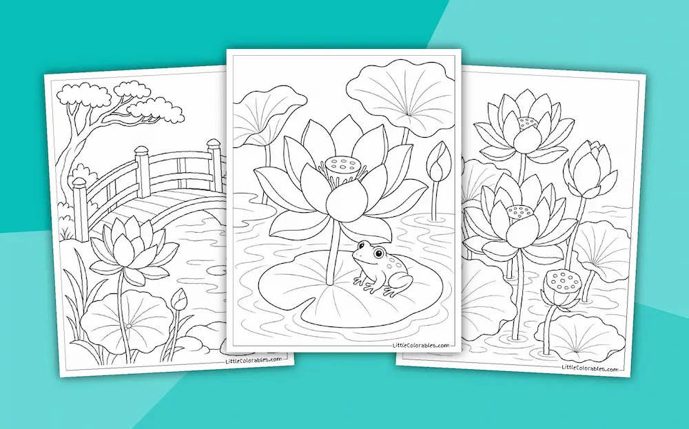
Honestly I’m running on three hours of sleep and cold coffee. But sitting down with these printable lotus flower coloring pages makes the chaos a little quieter.
The lines are thick enough for my toddler but detailed enough for my oldest to actually care. And yeah… you might even want to color one yourself when they finally go to bed.
Browse Other Flowers
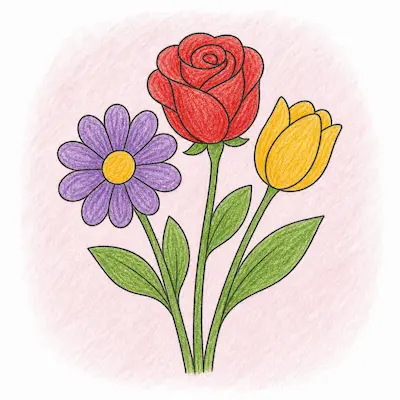
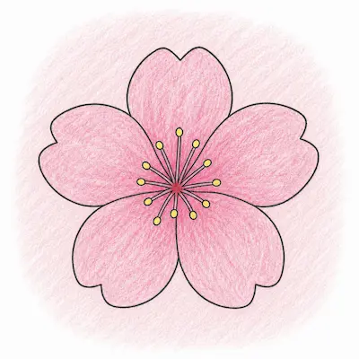
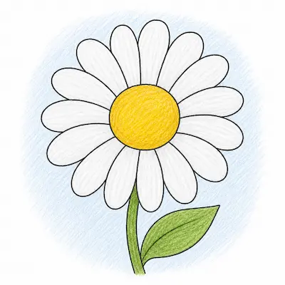
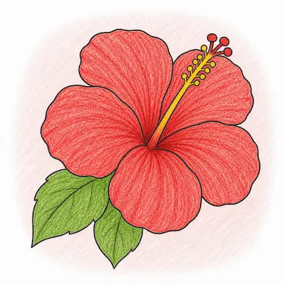
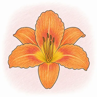
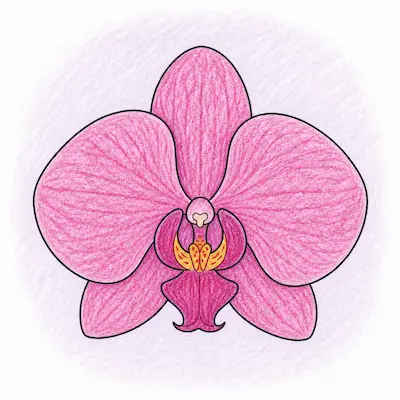
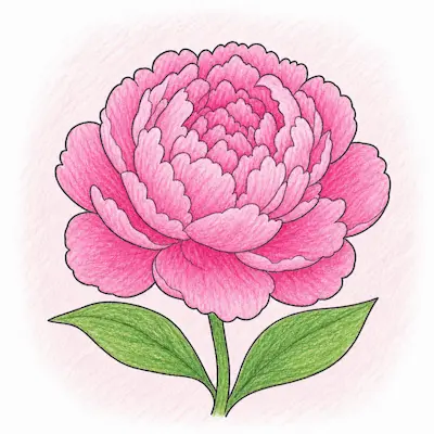
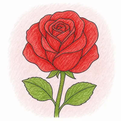
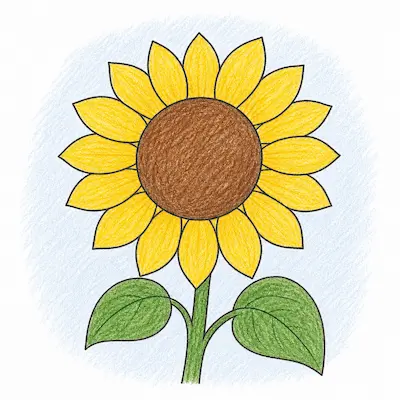
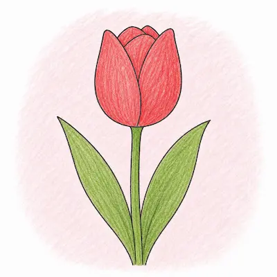
Featured Lotus Coloring Pages
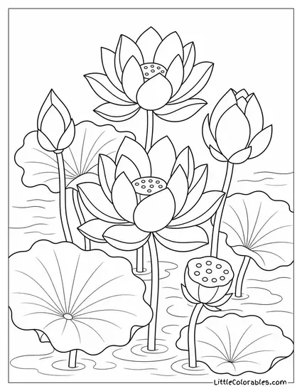
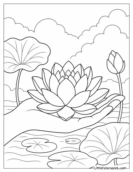
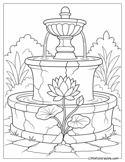
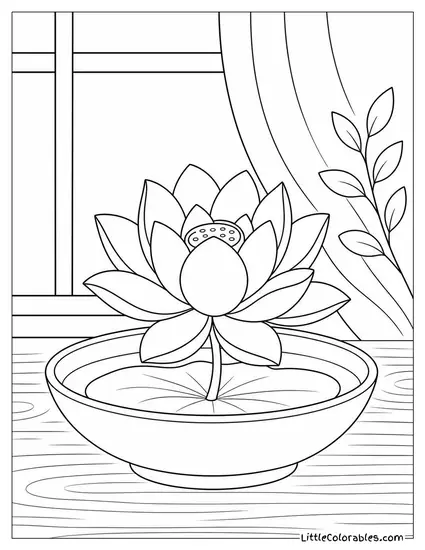
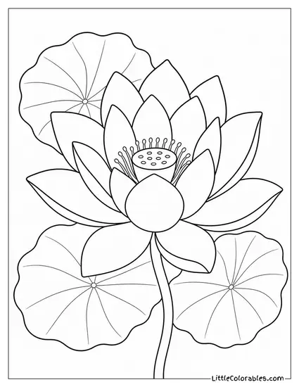
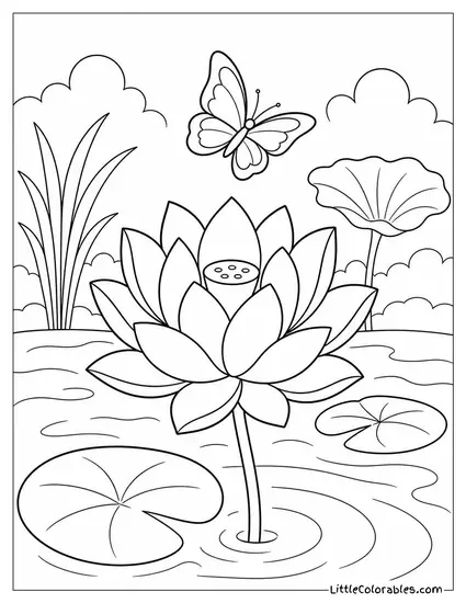
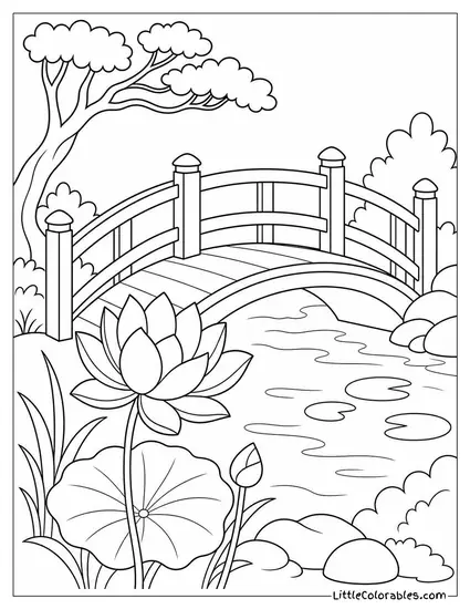
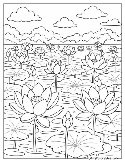
Lotus Coloring Pages Highlights
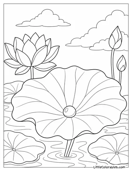
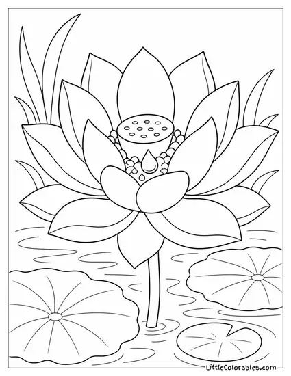
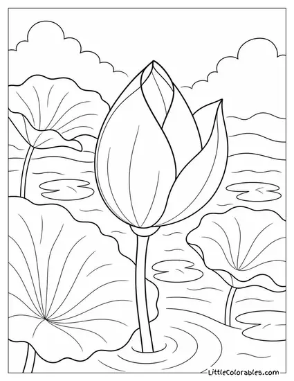
A Single Pearl of Water
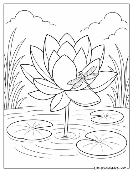
I remember showing my class how water pools on real leaves during a muddy field trip. It balls up just like a tiny glass bead. We captured that exact tension on this printable lotus coloring pages option.
You can really play with shading on that giant leaf to make the water drop pop. Just don’t overthink the background clouds.
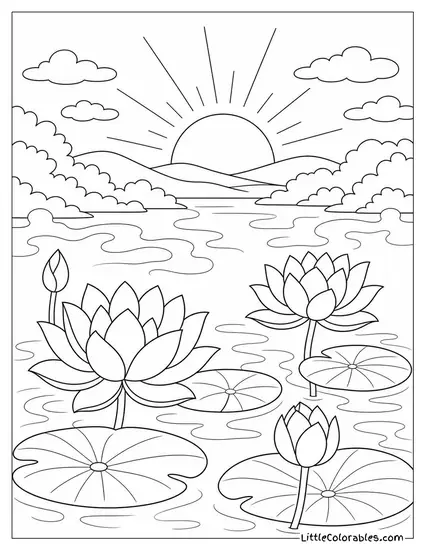
Sunrise and Morning Mist
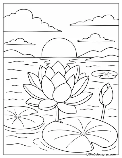
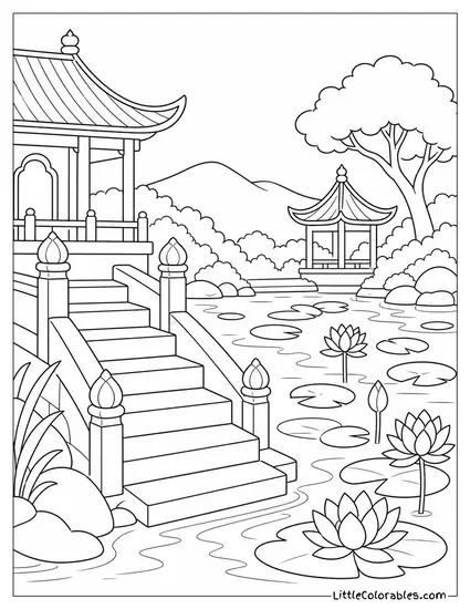
Nothing beats the quiet of a morning pond before the kids wake up. This coloring pages of a lotus flower scene has the sun peeking over rolling hills.
The little lines hovering over the water are supposed to be mist. My middle child insisted on coloring the mist purple. Honestly it looked amazing.
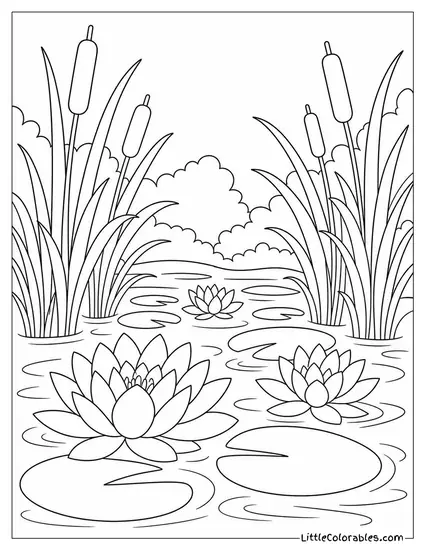
Hidden Among the Reeds
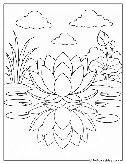
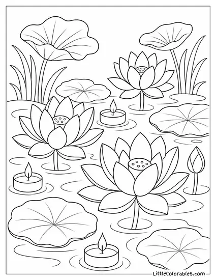
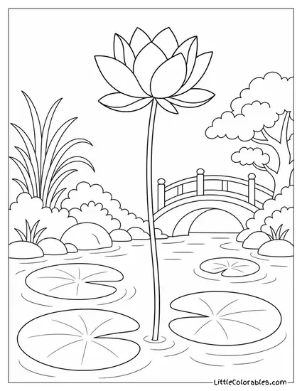
We framed this pond with thick cattails and tall grass to give it some depth. It feels like you are peeking through the brush to spot the flowers.
This one is a beast for practicing green tones. Grab a few green crayons and just go wild on those stalks.
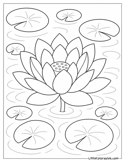
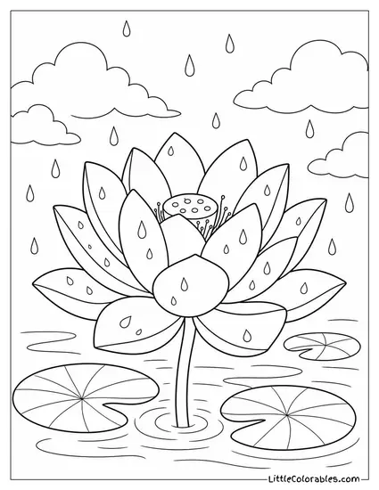
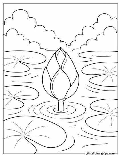
The Giant Centerpiece
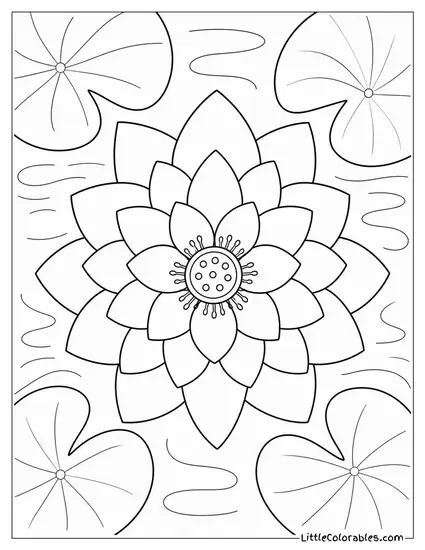
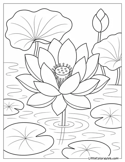
Sometimes you just need one massive flower taking up the whole page. This free lotus flower coloring pages design is surrounded by a bunch of tiny floating lily pads.
It is super relaxing to color all those small circles. I usually tell the kids to make every pad a slightly different shade.
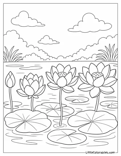
The Perfect Pair
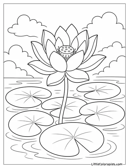
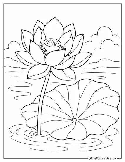
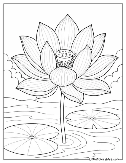
You get one bold bloom standing right next to its massive flat leaf here. It creates this heavy contrast that I absolutely love. The composition just works.
Focus on the veins of that big leaf at the bottom. Getting those details right makes the whole lotus coloring sheet look alive. And perhaps leave the sky blank.
Midnight Lotus Magic
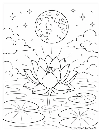
We added little radiating lines around the petals to make it look like the flower is literally glowing in the dark. The full moon above it even has crater details.
This is the perfect excuse to break out the dark blue and black markers. Let the kids go heavy on the night sky so the white petals stand out.
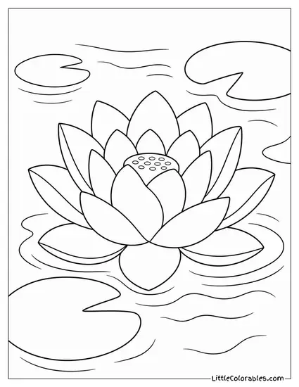
The Busy Little Bee
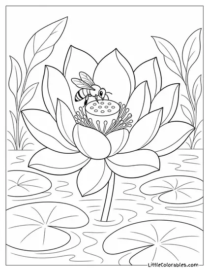
If you look closely at the center of this bloom you will see a tiny bee touching down. It is busy collecting pollen from that weird showerhead looking part of the flower.
My youngest always gravitates toward bugs. This printable lotus coloring pages design keeps him occupied for around 14-15 minutes. A total lifesaver while I make dinner.
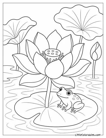
Frog on a Lily Pad
You cannot have a pond without a frog sitting exactly where he belongs. He is just chilling on the front pad looking up at the petals.
Getting the bumpy texture on his back is surprisingly fun. Every time we print this coloring pages of a lotus flower it becomes a fight over who gets to color the frog.
Tips for Coloring Lotus Coloring Pages
1. Ditch the Flat Pink
Most people just grab a standard pink crayon and aggressively scrub it over every single petal. That ruins the delicate look completely. A real lotus is rarely just one solid block of neon color. All this color theory comes down to one thing: do not overcomplicate it.
You need to start light. Lay down a soft baby pink first, then build up darker magenta only at the very tips of the petals. Let the base near the center stay almost totally white. It makes the flower look like it is glowing from the inside.
2. Water Reflection Tricks
Coloring water is a total nightmare for most kids. . . they just scribble a dark blue rectangle and call it a day. But these ponds have ripples and reflections. You have to treat the water like a mirror.
If the sky is yellow from the sunrise, put some yellow streaks in the water below it. Don’t be afraid to leave horizontal white lines uncolored to look like light bouncing off the surface. It might cause some inconvenience when figuring out the shadows, but the result is worth it.
3. The Secret to Green Leaves
Lily pads and lotus leaves are huge flat surfaces that can easily look boring if you aren’t careful. Nature is messy and chaotic. So grab around 3 or 4 different greens from your stash. Or rather, dig out every single green you own.
Start with a neon green for the veins. Then fill the rest with an olive or forest green. Sometimes we even throw a little yellow near the edges to show where the sun is hitting them. It keeps the eye moving around the page.
4. Night Skies Need Depth
For the moonlit page, a flat black background will just bleed into your line work and ruin the picture. Space isn’t just black. It has deep blues and purples hiding in the dark.
I always have the kids start with a layer of dark navy blue first. Then gently go over it with black, pressing harder near the edges of the paper. Leave the area right around the glowing lotus a little lighter to sell the effect. It makes the whole lotus coloring sheet leap off the desk.
5. Grounding the Center
That weird center part of the flower is called the receptacle. It looks like a little yellow showerhead sticking out of the petals. A lot of kids ignore it and just color it the same pink as the rest.
Make that part bright, punchy yellow. It anchors the whole drawing and gives your eye a place to rest. And if you add tiny brown dots inside those little holes it looks incredibly realistic. They will probably break the yellow crayon doing it, but try it… it changes everything.
6. Mixing Media
Honestly I am a huge fan of combining supplies when things get stale. Crayons are great for big waxy areas like the leaves or the water. But they suck for tiny details.
We use fine-tip markers for the stars, the mist, or the little bugs. Then we switch back to colored pencils for the soft gradients on the petals. The texture contrast is insane. And kids love breaking the rule that you have to stick to just one box. Will this keep them quiet tomorrow? No idea. But today it works.
7. Embrace the White Space
You do not have to color every single square inch of the paper. I tell my class this all the time… negative space is your friend. It lets the artwork breathe.
Leaving the clouds stark white against a blue sky is a classic move. Or just leave the outer edges of the background completely blank so the main flower remains the total focus. Not every piece needs to be a dense, heavy wall of wax.
8. Frog Camouflage
Kids usually want to color the frog the exact same green as the lily pad he is sitting on. And what follows from this? The frog completely disappears into the background and you lose the whole point of him being there.
You have to force a contrast. If the pad is dark green, make the frog a bright, toxic yellow-green. Or give him brown spots. Just make sure he stands out from his little resting spot.