


Summer is hitting hard right now and my three kids are absolutely climbing the walls. I told the design team we needed something bright and tropical to break up the afternoon chaos.
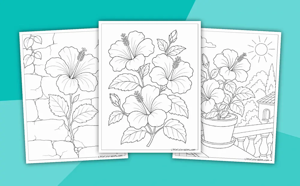
They knocked it out of the park with these new hibiscus coloring pages. I printed a massive stack yesterday and it actually bought me thirty quiet minutes. These printable sheets are honestly a lifesaver when the oppressive heat makes everyone so cranky.
You don’t need fancy art supplies for these either. Just grab whatever broken crayons are rolling around in the bottom of the sticky craft bin.
My youngest went absolutely feral with a neon pink marker on one of them . . . and it actually looked pretty cool. Just let them color and maybe pour yourself a cold drink while they do it.
Browse Other Flowers
Featured Hibiscus Coloring Pages
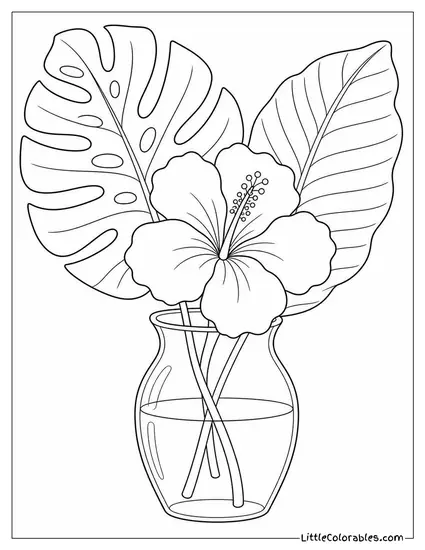
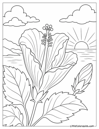
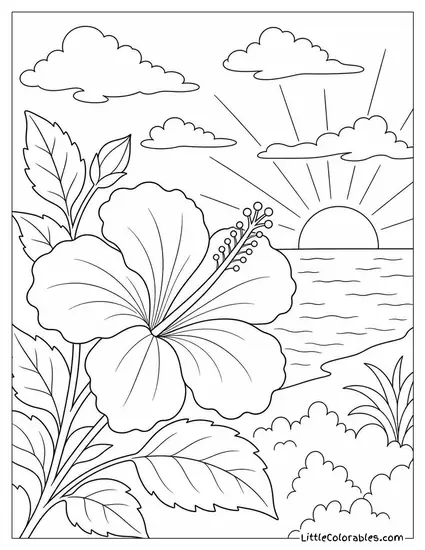
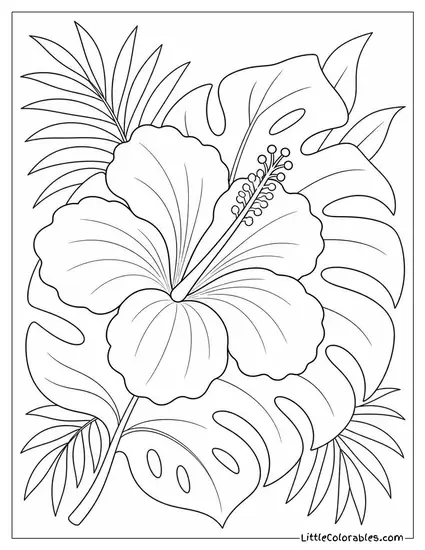
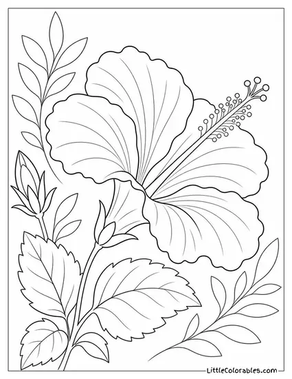
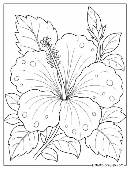

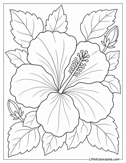
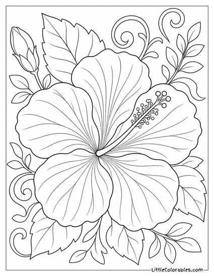
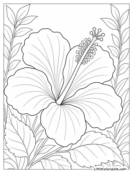
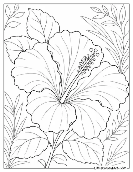
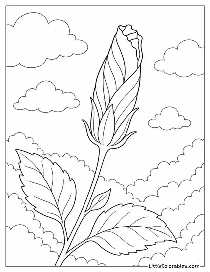
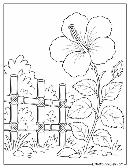
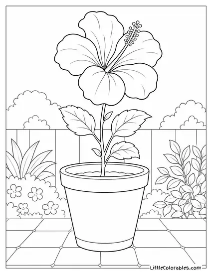
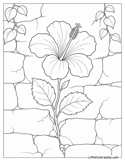
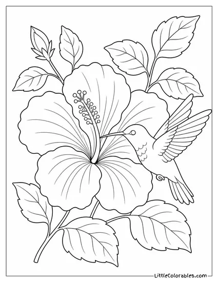
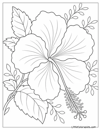
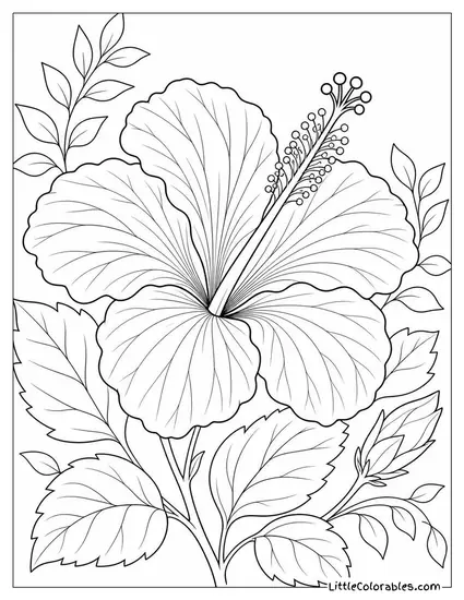
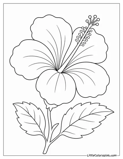
Hibiscus Highlights
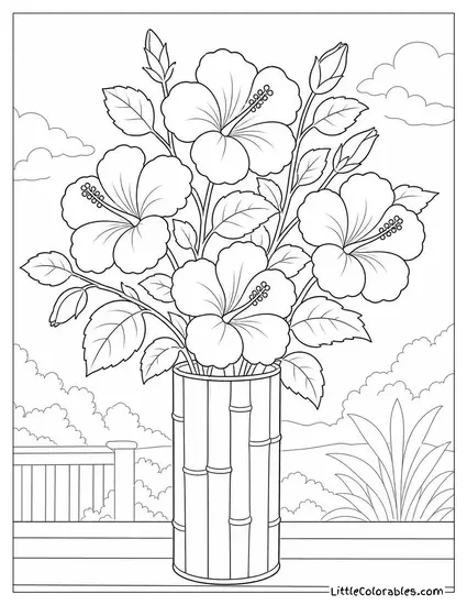
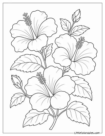
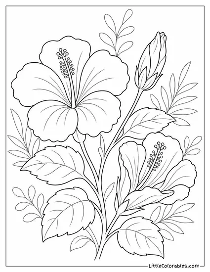
Three Blooms on a Branch
This design shows three large flowers clustered together on a single sturdy stem. The thick leaves give you a lot of space to play with different bright shades of green.
I think this one is perfect for older kids who have a bit more patience. The overlapping petals create some natural shadows that are fun to shade in. Or maybe they just scribble all over it, who knows.
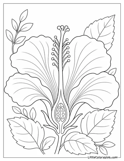
Botanical Cross-Section
We wanted something a little educational for this hibiscus flower coloring sheet. It literally slices the flower right down the middle so you can see the pistil and stamens.
It reminds me of those heavy science textbooks from when I was teaching third grade. You can point out the different plant parts while they color the tiny seeds inside. And what follows from this is usually a billion questions about how plants eat dirt.
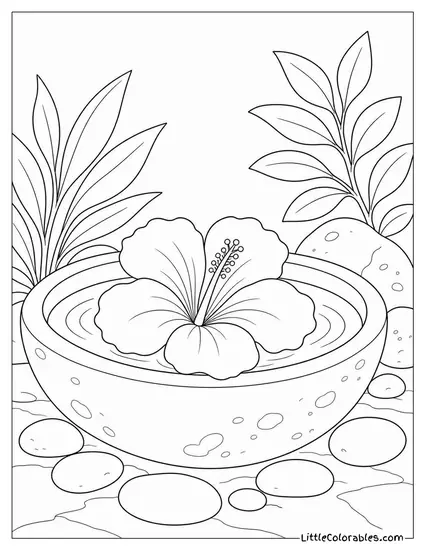
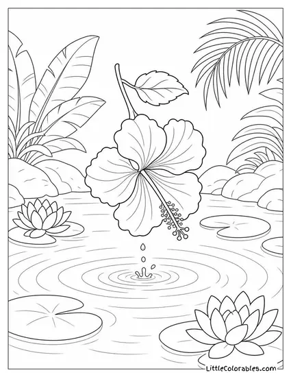
Floating in a Stone Bowl
There is a single bloom resting gently on the water inside a heavy stone basin here. The little round pebbles around the base add some nice gritty texture to contrast the soft petals.
I absolutely love the quiet spa vibes this specific layout gives off. Grab some cool blues and greys for the water and stone to make that central flower really pop out.
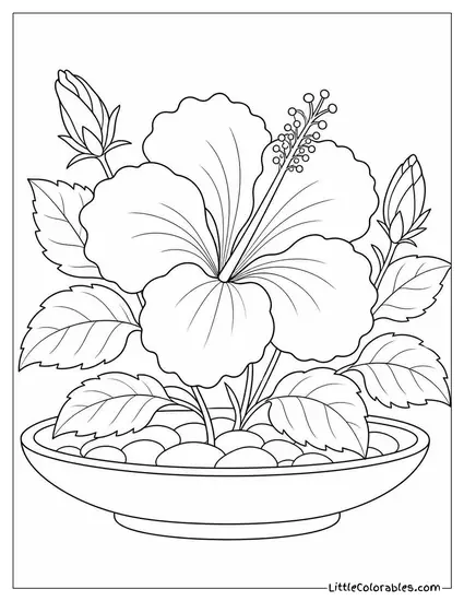
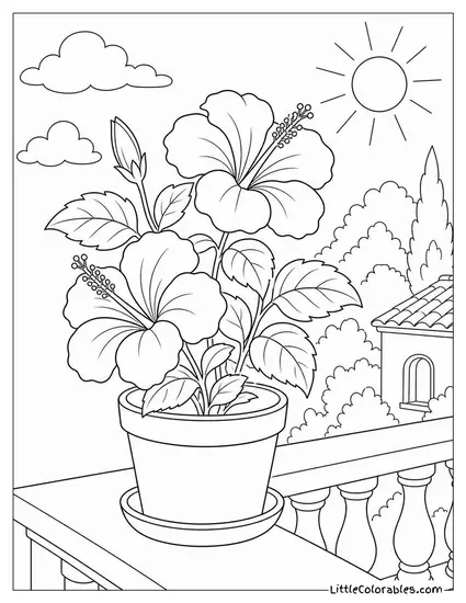
Wide Ceramic Dish
This is a tidy little potted plant sitting in a shallow ceramic dish filled with smooth stones. The leaves are broad and sort of fan out perfectly around the main thick stem.
My middle child spent twenty minutes just coloring those tiny rocks at the bottom. It is surprisingly calming. This printable hibiscus flower coloring pages collection wouldn’t be complete without a nice indoor plant scene.
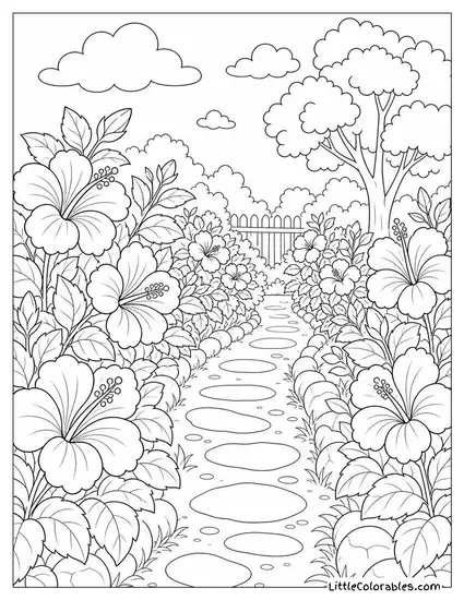
Garden Wall Hedge
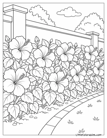
This one is massive and shows a dense hedge of flowers growing along a brick garden pathway. The perspective leads your eye right down the curved path toward the background clouds.
Honestly it is a lot of complicated coloring. But if you have a kid who loves doing big landscapes this is the perfect coloring pages of a hibiscus for them.
Split Seedpod and Spent Bloom
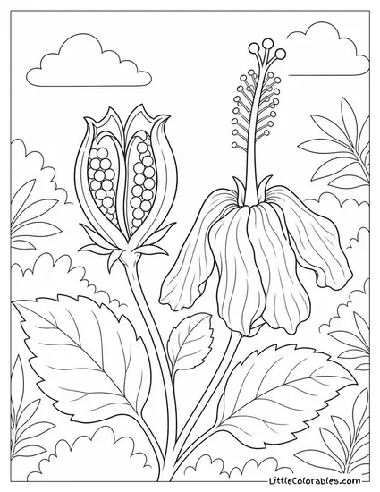
The team drew a really cool seedpod that has burst open right next to a drooping flower. It shows the messy and raw end of the plant’s life cycle.
Nature isn’t always perfect blooming flowers. The wilted petals on this free hibiscus coloring pages sheet give it a totally different moody feel. I suggest using muted browns and dark reds here.
Hot Tea and Dried Blooms
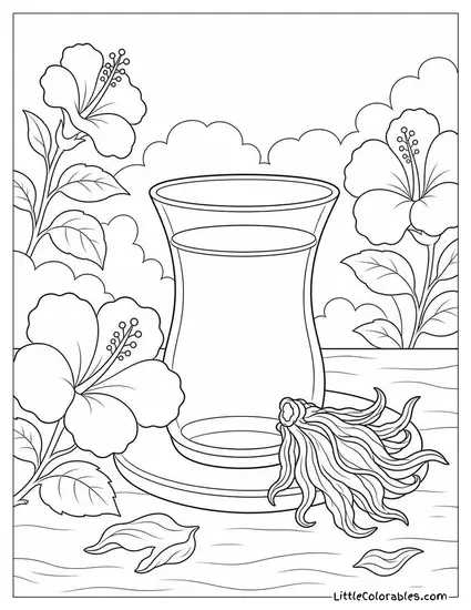
A tall elegant glass of tea sits on a table with a shriveled dried flower resting right beside it. There are a few stray leaves scattered casually around the base of the glass too.
I used to drink this tart red tea all the time when I was grading math papers late at night. You can color the liquid inside the glass a deep crimson to make it look authentic.
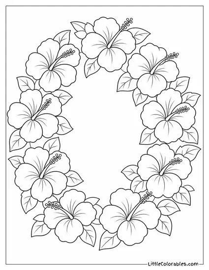
Circular Floral Wreath
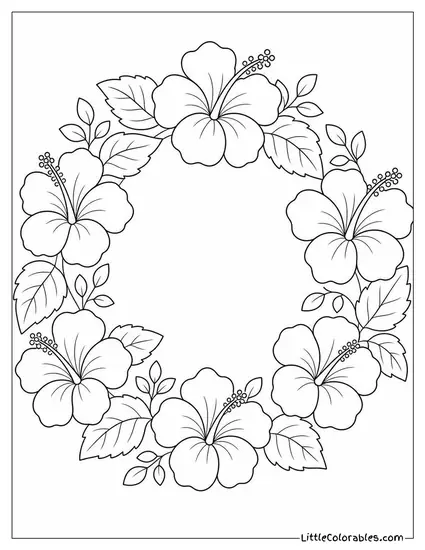
Here we have a perfect ring made entirely of alternating open flowers and clustered leaves. The center is completely blank so it lies totally flat on the page.
You could totally have the kids color this and then cut it out for a messy craft. Or just leave it as a simple hibiscus flower coloring sheet and let them fill the middle with their name.
Tips for Coloring Hibiscus Pages
1. The Stamen is the Star
That long fuzzy thing sticking out of the middle is called the stamen. It’s the signature visual look of this specific plant. Don’t just color it the same flat red as the petals because it will completely disappear into the background.
I usually tell my kids to make it bright yellow or even a pale orange. It creates a massive contrast and makes the flower look vaguely 3D. Just a quick pop of yellow completely changes the dynamic. It anchors the whole image.
2. Blending Petal Edges
These flowers have those iconic ruffled edges that look sort of fragile. If you press too hard with a crayon on the rim it looks chunky and weird. You want the edges to feel light.
Try coloring heavily near the center of the flower and then easing up the pressure as you get to the outside. It is a basic shading trick. And honestly? It works around 78 percent of the time even if your kid is just aggressively scrubbing with a Crayola. This makes any coloring pages of a hibiscus look a hundred times better. Or rather, it makes it look intentional.
3. Leaves Aren’t Just Green
Look at the sheer volume of foliage on some of these sheets. If you fill every single leaf with standard forest green it gets muddy fast. Real plants have weird discoloration and bright sunny spots.
Mix in some yellow for the parts where the sun hits. Maybe throw a tiny bit of blue in the shadows underneath the bottom leaves. Will a toddler care about color theory? No. But it is fun to try. All this math comes down to one thing: don’t overcomplicate it.
4. Texturing the Seedpods
A few of our designs have those bumpy little seedpods bursting open. The texture there is super rough compared to the smooth petals. You need to translate that physical grit to the paper.
Instead of coloring flat strokes try using tiny little dots or harsh scribbles. It is called stippling in fancy art terms. It makes the seeds look hard and woody against the delicate flower parts. Just tap the marker over and over… it might cause some minor inconvenience if they bang too hard.
5. Water Needs Movement
For the designs where the flower is floating in a bowl you have to think about the water. Water is rarely just a flat sheet of blue unless it is perfectly still. The heavy stone bowl creates tiny ripples.
Leave some thin white lines completely uncolored to act as reflections of the bright sky. Then use a dark blue right underneath the floating flower to ground it physically. Contrast is absolutely key here. It makes the liquid actually feel wet.
6. Managing the Hedge Chaos
That massive garden wall image has like fifty different flowers crowded together in one spot. It is completely overwhelming if you look at the whole thing at once. Kids usually burn out halfway through.
My advice is to pick three colors and just alternate them randomly across the dense hedge. Red, pink, and bright orange. It creates a wild tropical vibe without requiring them to think too hard about every single bloom. Sometimes you just have to hack the process.
7. The Tea Glass Transparency
The hot Turkish tea glass design is tricky because you are dealing with glass and liquid. You want it to look see-through. Opaque wax crayons will ruin the illusion immediately.
This is where colored pencils absolutely dominate. You can color lightly so the rough white paper shows through making it look transparent. Draw a slightly darker colored rim around the edge of the glass to give it some physical weight. It might cause some frustration at first but they figure it out eventually.
8. Backgrounds Matter Too
A lot of kids just color the main flower and leave the rest of the page completely blank white. Which is fine. But it makes the flower look like it is floating in a sterile digital void.
I always encourage my three little monkeys to quickly scribble a background color. Even just a light messy wash of sky blue or a hazy yellow sunshine makes the whole composition feel finished. It doesn’t need to be neat. Messy backgrounds are honestly better anyway.