


Summer fever hit our house aggressively this year. My three kids were tracking mud everywhere and destroying the actual garden just trying to find blooms.
So I finally gave up and told them we were sticking to flower coloring pages inside. Our team pivoted from monsters to botanicals immediately.
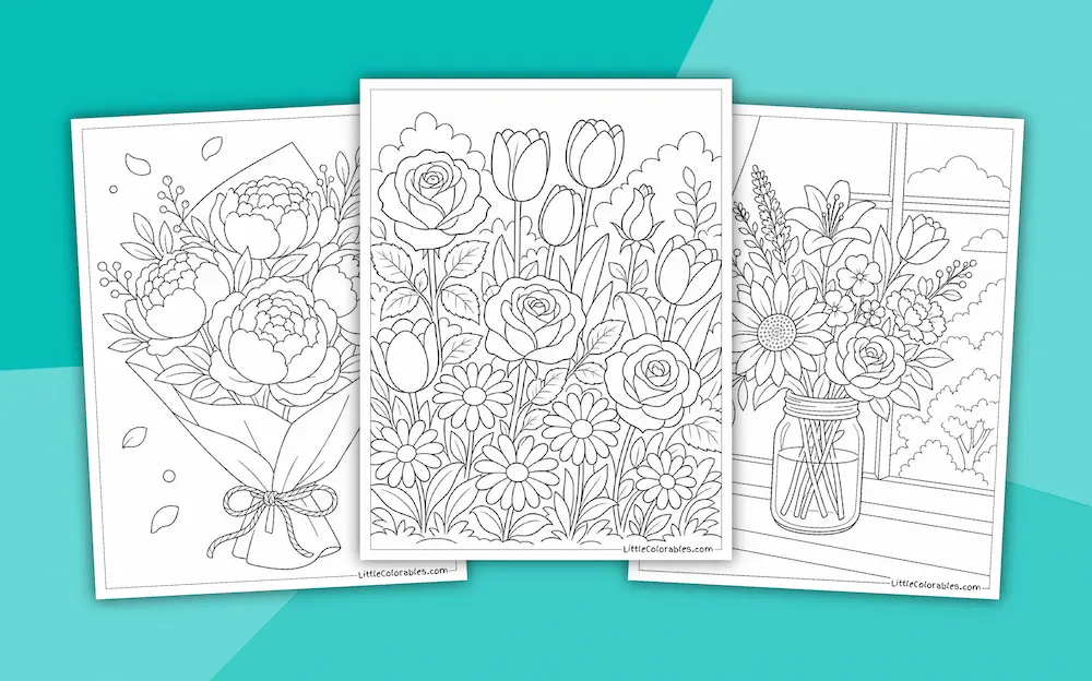
These brand new printable flower coloring sheets honestly saved my sanity, and the walls, this entire week. You know how it is with a chaotic house.
Sometimes you just need ten minutes of relative quiet to drink a lukewarm coffee. So grab your stray crayons and let them go wild with the sheets.
Browse Other Flowers
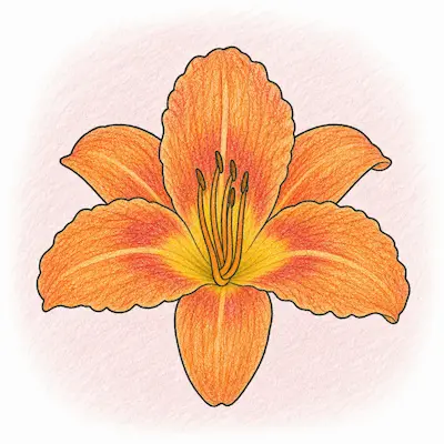
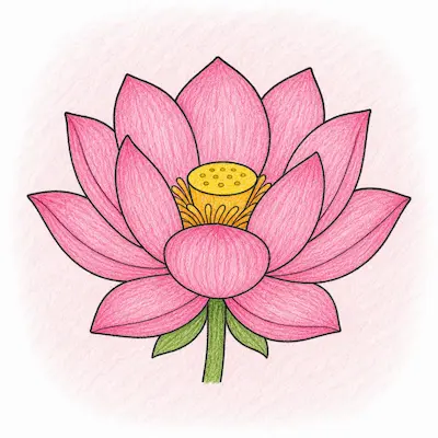
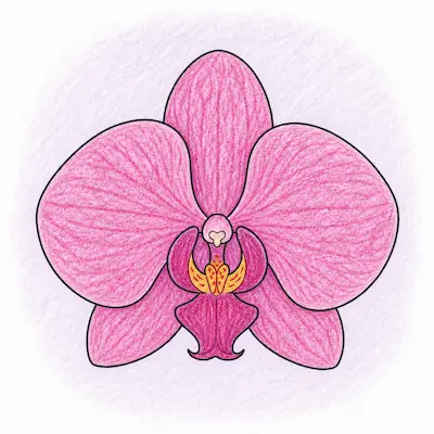
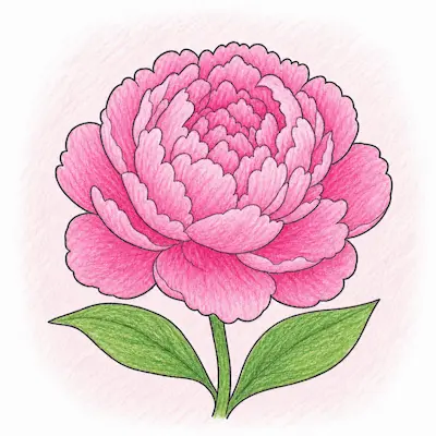
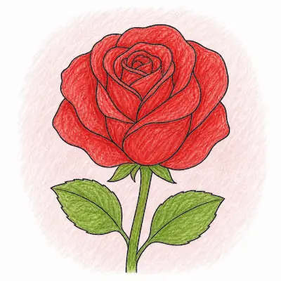
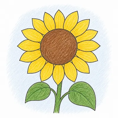
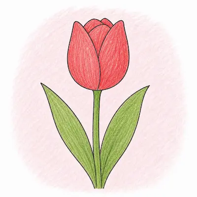
Featured Flower Coloring Pages
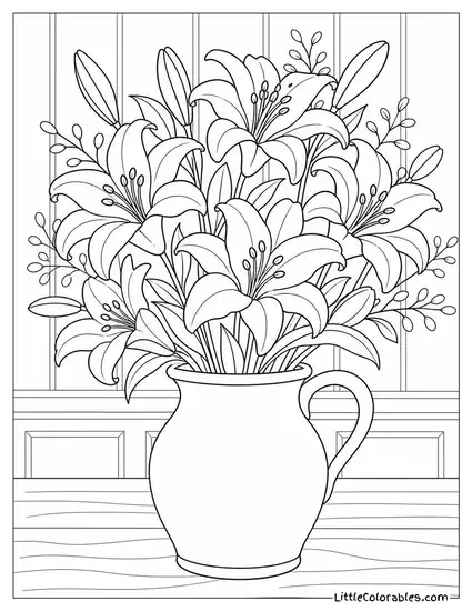
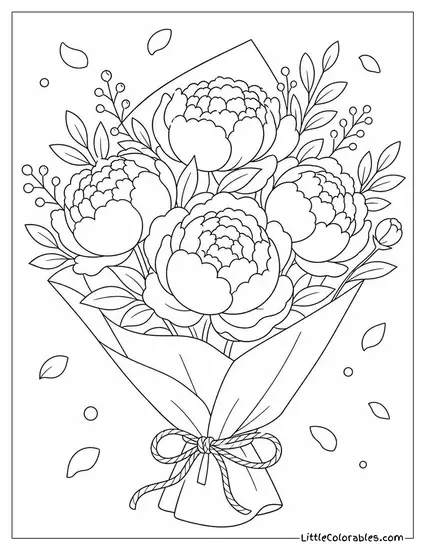
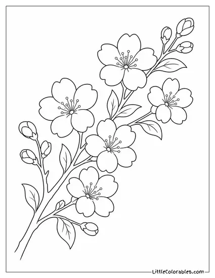
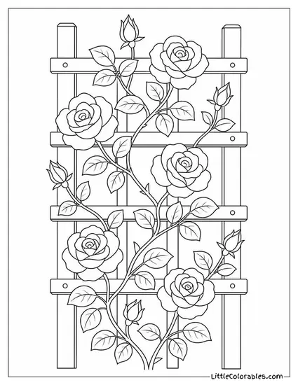
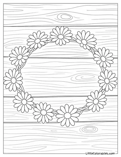
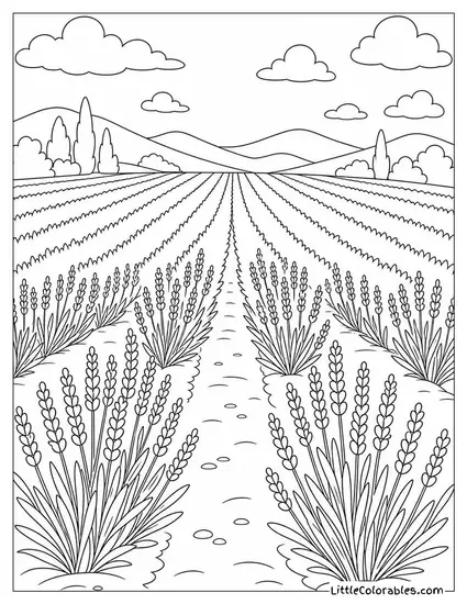
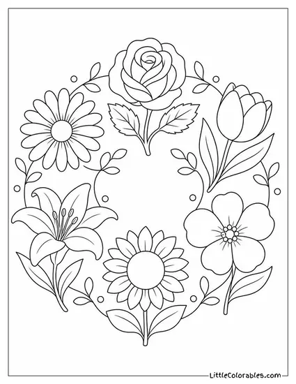
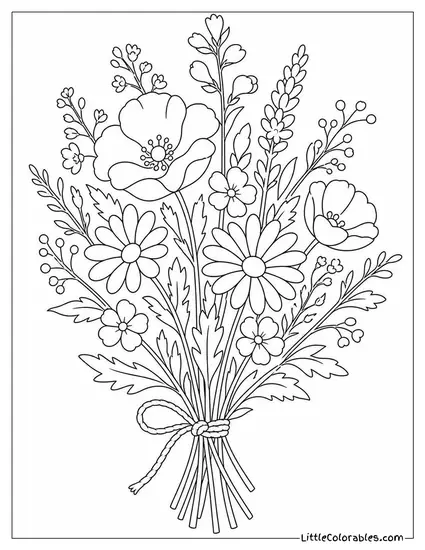
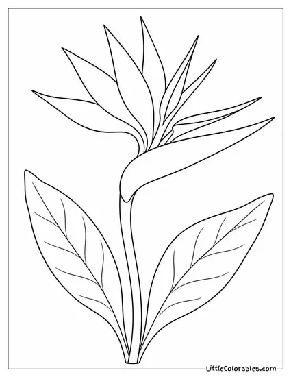
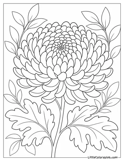
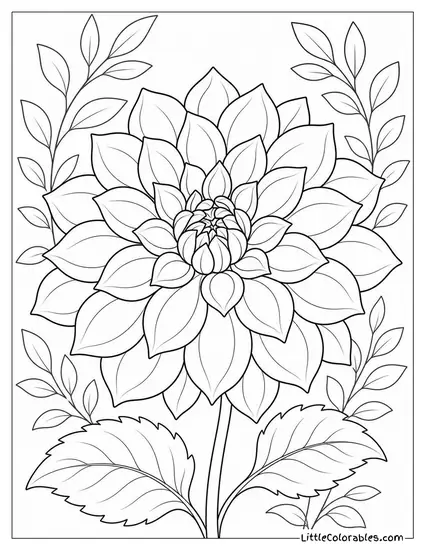
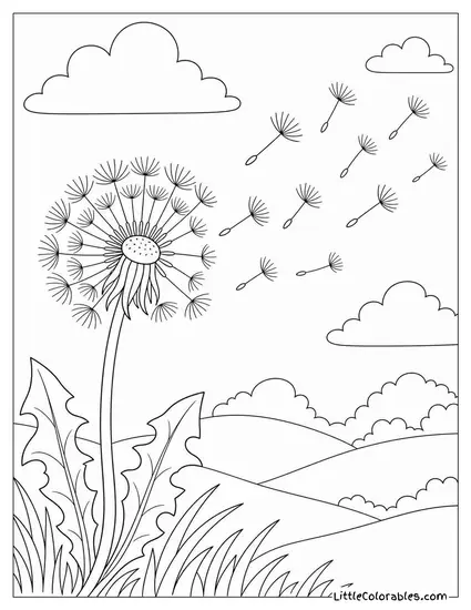
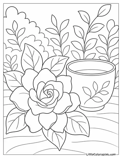
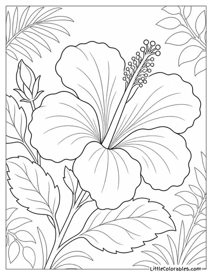
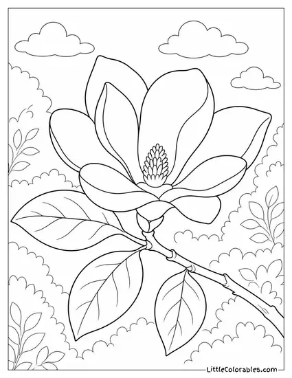
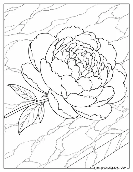
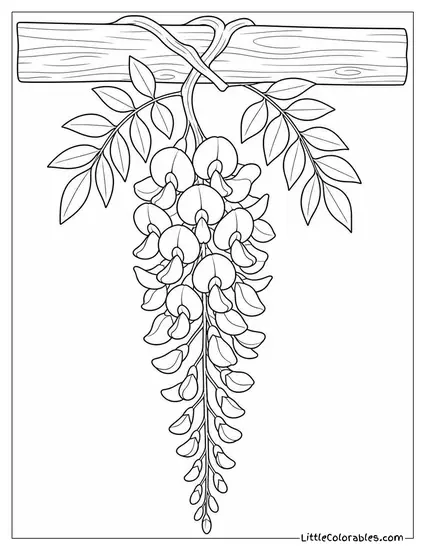
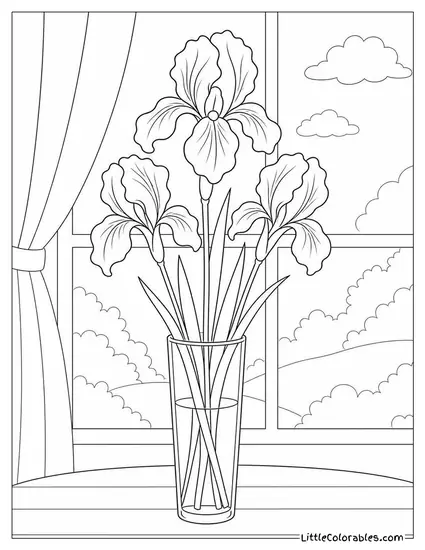
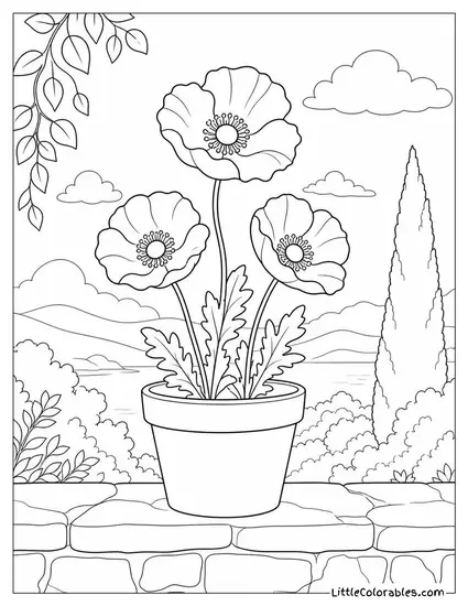
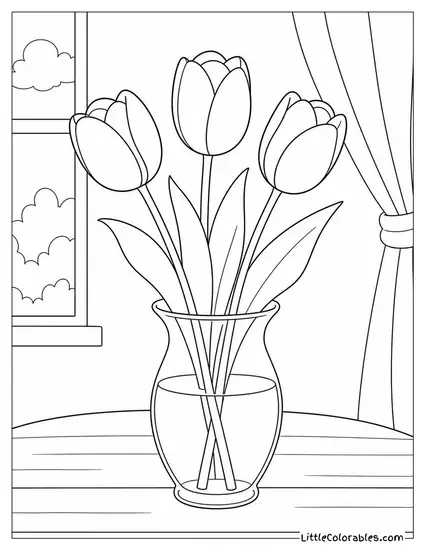
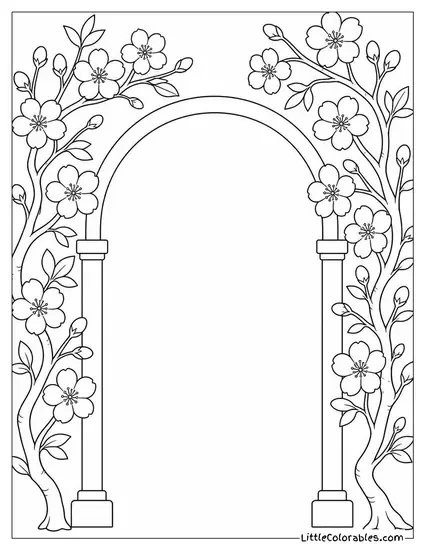
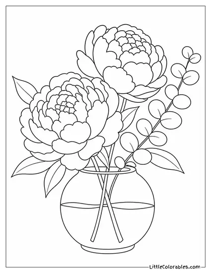
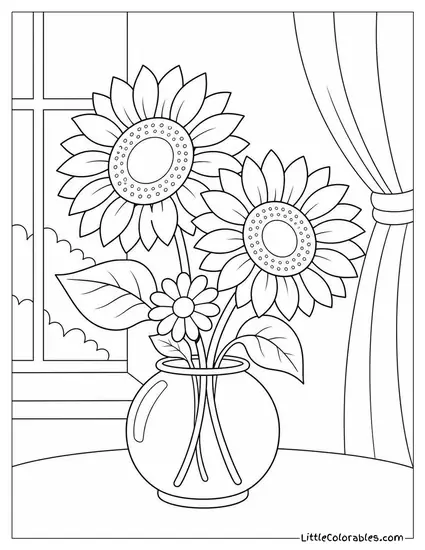
Flower Coloring Page Highlights
Roses, Tulips, and Daisies
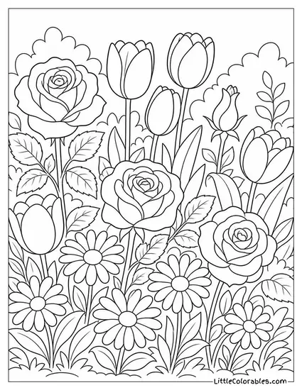
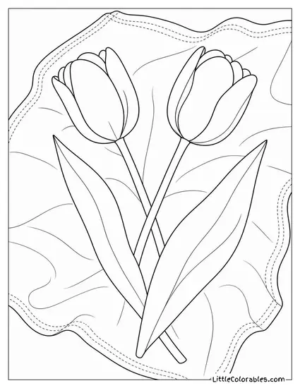
This one is packed tight with a garden bed of roses, tulips, and daisies in full bloom. It is a bit complex for toddlers, or rather, it is a total nightmare for them.
Older kids really get into the weeds with this flower coloring sheet. They can practice shading the rounded tulip petals against the spiky daisy leaves. It usually takes my oldest around 34 minutes to finish.
Hand Holding a Wildflower Bouquet
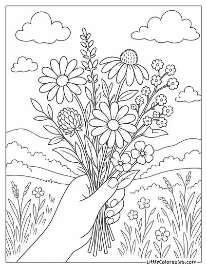
I love the perspective here with a hand holding a small mixed wildflower bouquet against a rolling landscape. It gives a physical grounding element to the page. Kids sometimes struggle with drawing hands so having it outlined helps them practice flesh tones.
You can really see the delicate lines of the clover and daisies in the grip. It feels like a late summer afternoon hike grabbed right off the paper.
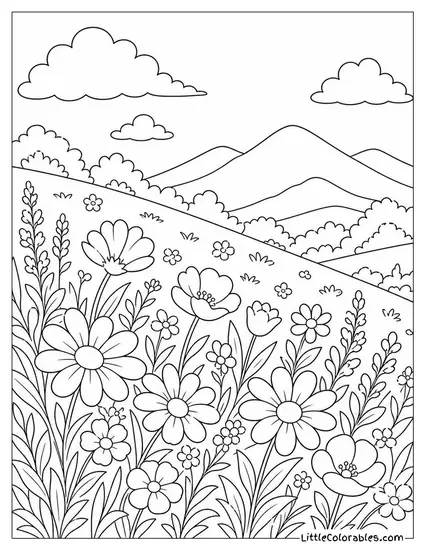
Hillside Covered in Wildflowers
We asked the illustrators to capture a hillside covered in blooming wildflowers stretching back to the mountains. The depth of field on this one is fantastic. It forces kids to think about foreground versus background.
You have large detailed petals up close and tiny rolling hills in the back. This makes an excellent coloring page of a flower landscape for teaching perspective.
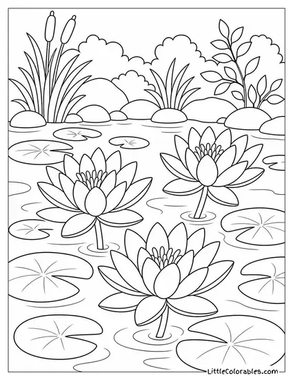
Lily Pond With Floating Pads
Water reflections are notoriously hard. But this lily pond with three blooms and floating pads makes it incredibly accessible for little artists.
You get the tall cattails in the background framing the water perfectly. My middle child actually used watercolors on these free flower coloring pages and the paper held up decently. Highly recommend trying out different mediums for the water texture.
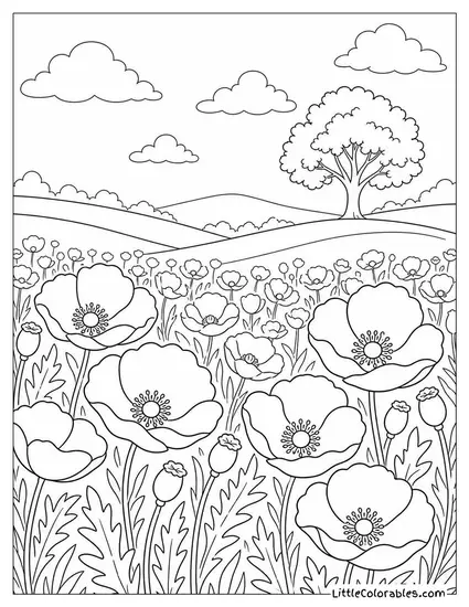
Poppy Field With a Lone Tree
Here we have a massive poppy field with a single tree in the distance under a cloudy sky. The repetitive nature of the poppy cups is almost meditative. Sometimes repetitive tasks calm down a severely overstimulated brain.
Most kids instantly grab red for poppies. But I always tell them to throw in some oranges or yellows to make it pop. It is a really forgiving flower coloring sheet if you accidentally mess up the lines.
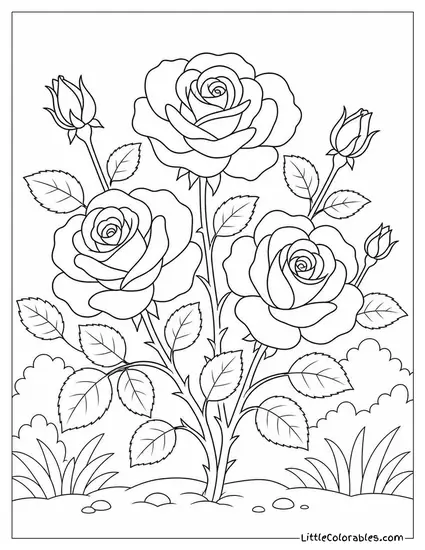
Rose Bush With Open Blooms
This is a classic rose bush with three open blooms and budding stems surrounded by grass. The thorns are drawn thick enough so kids actually recognize them. We had to revise those thorns about 4 times to get them right.
Getting the shading on layered rose petals is basically an entry-level lesson in geometry. It is probably the most requested coloring page of a flower we have right now.
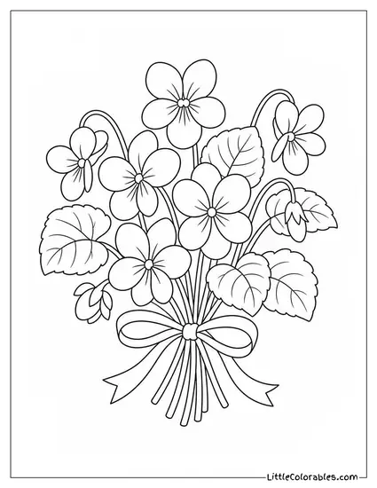
Small Posy of Violets
I asked the team for something simple here. A small posy of violets tied with a thin ribbon is what they delivered. It is sweet and heavily nostalgic.
It does not overwhelm you with a massive, busy background. These make perfect printable flower coloring pages for DIY Mother’s Day cards.
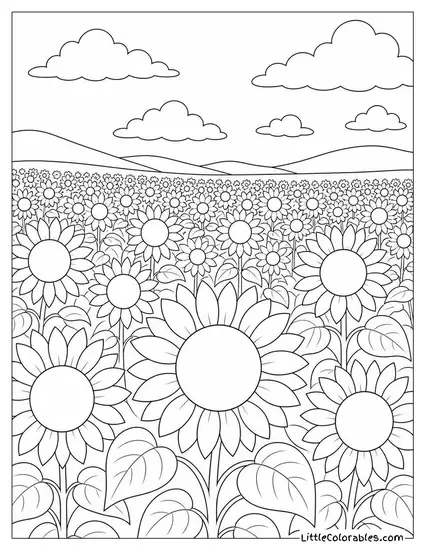
Sunflower Field Stretching to the Horizon
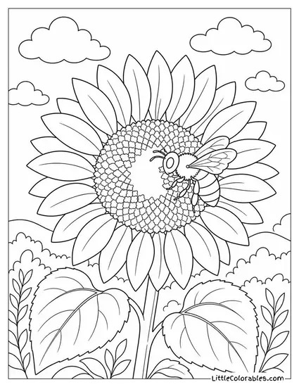
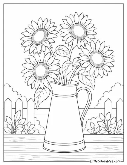
Sunflowers are basically happy faces on stalks. This sunflower field stretching to the horizon gives you about 47 different flower heads to fill in. It is exhausting just looking at it.
But kids who love yellow will be in absolute heaven. These specific flower coloring pages for kids are great for practicing sky gradients. Have them blend blue down into yellow at the horizon line.
Tips for Coloring Flower Coloring Pages
1. Don’t Just Use Flat Green
Leaves are never just one boring shade of green. If you look at a real garden the foliage ranges from yellow-green to deep blue-green. I try to get my kids to use at least three different greens on a single page.
It completely changes the depth of the image. Layering a bright lime over a dark forest green adds instant sunlight. Try it on those thick bushes.
2. Stems Need Structure
The stems are holding up heavy flower heads. They shouldn’t look like limp noodles. I tell my third graders to press harder with their pencils on the shaded side of the stem. Building a flower is just like framing a house where the stem is the load-bearing wall.
This gives it a rounded 3D effect. It is a tiny detail that makes a massive difference. You can even add a touch of brown near the base to root it.
3. Blending Petal Colors
Real petals usually have a gradient going from the center out. The middle is often darker or even a totally different color. Start light at the edges and press harder as you move inward.
Take those flower coloring pages for kids and really let them practice blending red into pink. Or yellow into orange. It feels like absolute magic to them.
4. Watch the Backgrounds
So many people ignore the sky or the dirt. Blank white backgrounds leave the flowers floating in space. A quick wash of light blue or pale yellow behind the blooms grounds the whole scene.
You don’t have to color it solidly. Just a sketchy, messy aura around the main subject works perfectly. It pushes the flowers forward visually.
5. Shadows Aren’t Black
When kids want to make something darker they immediately reach for the black crayon. It just turns everything to thick mud. I learned teaching art that purple or dark blue makes much better shadows.
Especially on yellow or red flowers. A dark purple shadow in the folds of a rose petal looks rich and natural. Black just kills the vibrancy entirely. All this color theory comes down to one thing: keep it bright.
6. Highlighting with Erasers
If you are using colored pencils the eraser is actually a drawing tool. Color a petal heavily. Then take a clean eraser and swipe it right down the middle to pull up some pigment.
Boom . . . instant highlight. It mimics the shiny surface of a waxy leaf or a sunlit petal. The kids think it is a neat parlor trick.
7. Mixing Mediums
Who says you have to stick to just markers or just crayons? Try doing the delicate flower petals in colored pencil. Then block in the large background areas with a fat marker.
The contrast in textures looks amazing. The shiny wax of a crayon next to the matte finish of a marker creates natural separation. Just don’t let them mix watercolors and cheap printer paper.
8. Embrace the Mess
Staying in the lines is highly overrated. Sometimes the most beautiful coloring pages are the chaotic ones where colors bleed into each other. I stopped correcting my youngest when he turns a daisy completely neon purple.
Nature is weird and unpredictable anyway. Letting them scribble outside the borders builds confidence and motor skills. Will this laissez-faire approach make them professional artists tomorrow? No idea. But today — it works.