Getting my kids to actually eat real fruit is a daily negotiation that I almost always lose. But hand them a box of crayons and suddenly they are completely obsessed with citrus and berries.
These fruit coloring pages are basically the only reliable way I can get around 17-18 minutes of quiet coffee time before the morning rush completely wrecks me.
My youngest literally spent an hour trying to make a strawberry look “juicy” yesterday. It is honestly fascinating how much they focus on these fruit coloring sheets when the iPad is finally dead.
I highly recommend using decent paper if your kids press down hard with their markers. A standard 80 GSM paper works fine for a quick scribble, but heavier cardstock makes a coloring page feel like actual art.
Browse Other Fruits
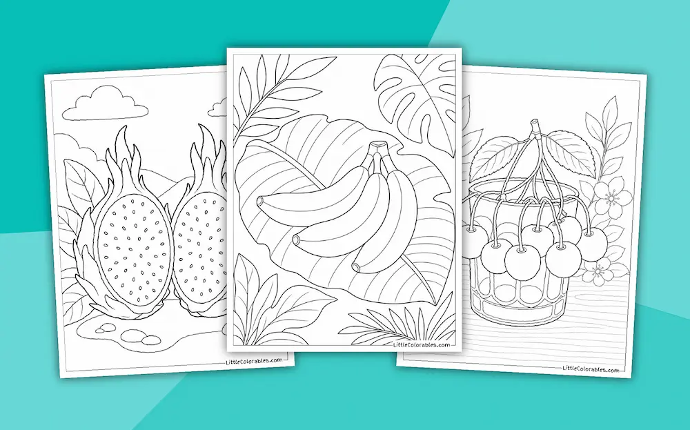
Featured Fruit Coloring Pages
Fruit Coloring Page Highlights
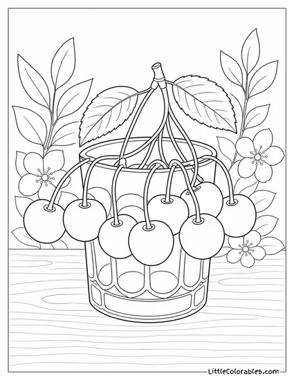
Cherries Draped Over a Glass
This one has a really nice contrast between the smooth glass and the small cherry stems. My six-year-old daughter tested this one and immediately decided all the cherries needed to be neon pink. I think the leaves framing the background add just enough complexity without being annoying.
Getting the curved lines of the glass to look right when coloring is a fun challenge. You can leave parts of the glass white to make it look like a reflection. Or just color the whole thing purple, whatever works.
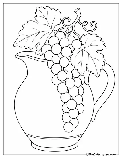
Grapes Spilling from a Ceramic Pitcher
I always loved those old still life paintings that have fruit casually hanging off of rustic pottery. We designed this plain ceramic pitcher to give kids a big, open space for solid coloring. The grapes themselves take a lot of patience to fill in one by one.
It might cause some inconvenience if you use a really thick marker for the little stems. A fine-tip pen works better for the detailed parts at the top. The big pitcher is practically begging for a heavy wash of watercolor if you have heavy enough paper.
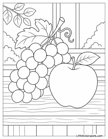
Grapes and an Apple on the Sill
This scene feels like sitting in a quiet kitchen on a Sunday morning. The single apple next to the bunch of grapes gives a really satisfying mix of shapes to work with. There is a window in the background that you can easily turn into a sunny day or a dark night sky.
I usually tell my kids to color the wood grain on the table first before doing the fruit. It grounds the whole picture. Honestly the little leaves on the vine are my favorite part to shade.
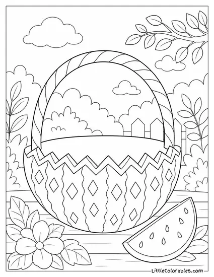
Carved Watermelon Basket
We used to make these exact zigzag watermelon baskets for backyard barbecues when I was younger. The geometric carving pattern along the edge is super satisfying to fill in with alternating colors. There is a slice sitting right next to it that just screams summer.
The background has some cute little clouds and a fence that tie the whole outdoor vibe together. My oldest kid likes to color the rind really dark green to make the red inside pop. It is a solid layout for practicing color contrast.
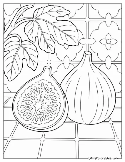
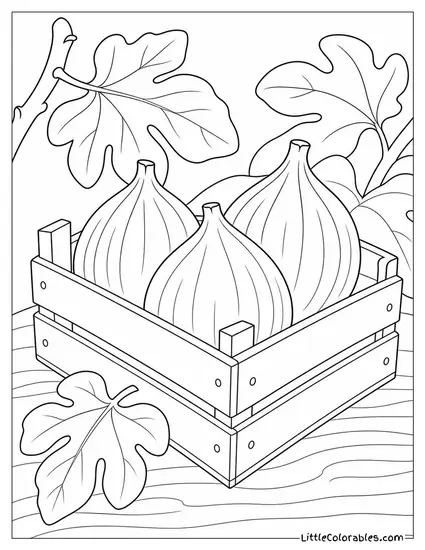
Sliced Figs on a Decorative Tile
Figs have this really weird, almost alien texture inside that is surprisingly fun to color. We put these on a background of ornate tiles because the shapes play so well together. The little seeds inside the halved fig are perfect for a sharp colored pencil.
You don’t have to stick to realistic purples and reds for this one. I saw someone do the background tiles in bright yellow and it looked incredible. Let’s just say it is a very flexible page.
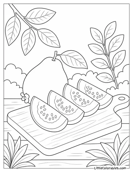
Guava Quarters on a Cutting Board
Guava isn’t the most common fruit in kids’ coloring books, but the fanned-out slices look fantastic on paper. The wood grain on the cutting board gives you a chance to practice blending different shades of brown. Surrounding foliage keeps the tropical theme front and center.
The inside of a guava can be pink or white, so you have options. I don’t know the exact botanical rules for guava leaves, but I usually just go with a dark, waxy green. It just feels right.
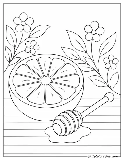
Grapefruit Half with a Honey Dipper
This layout is probably the most visually balanced one in the whole collection. The segmented grapefruit sitting next to the little wooden honey dipper just works. The puddle of honey underneath is a great spot to practice making things look sticky and translucent.
My daughter insists that grapefruits must be colored orange, even though I keep telling her about ruby reds. The little floral background elements are delicate enough that they don’t distract from the main fruit. Just don’t press too hard on the honey dipper grooves.
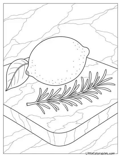
Lemon and Rosemary on Marble
I absolutely love the marble slab texture we put underneath this lemon. The sharp, needle-like rosemary sprig contrasts so nicely with the round, bumpy skin of the citrus. It feels a little more grown-up than a standard cartoon fruit page.
Trying to color marble can be tricky, but light grey streaks over a white background usually does the trick. The lemon itself is basically a giant blank canvas for trying out different yellow shading techniques. A really sharp pencil is mandatory for that rosemary, though.
Tips for Coloring Fruit Coloring Sheets
1. Mixing Up Your Citrus Shades
A lot of kids just grab one yellow crayon for a lemon and scrub the whole page until the paper tears. It works, but it looks incredibly flat. I always try to show them how to layer a tiny bit of pale green near the ends to make it look a little unripe.
When you use these free fruit coloring pages as a starting point, you can really push the boundaries of normal colors. Adding a tiny bit of orange near the center of a lemon gives it so much depth. It is a small trick but it changes everything. Try it out on the grapefruit page.
2. Faking the Peel Texture
Fruit isn’t perfectly smooth in real life. Oranges and grapefruits have those little dimples all over them. If you take a darker colored pencil and just tap it lightly around the edges, you get this great stippled effect.
I figured this out while testing a new fruit coloring sheet that felt too empty. The texture makes the drawing pop off the page. You don’t have to cover the whole thing. Just focus on the shadowed areas underneath.
3. Leaving White Space for Shine
Getting fruit to look wet or juicy is notoriously annoying. Or rather, it just takes a bit of planning. The easiest way to cheat it is to just not color a small sliver on the top curve of a grape or a cherry. That untouched white paper suddenly acts like a glaring light reflection.
A white gel pen can also save the day if you accidentally colored over the whole thing. I don’t know why, but applying that tiny white dot is the most satisfying part of the process. It instantly makes the fruit look 3D. Kids love this trick.
4. Grounding the Scene
A lot of our printable fruit coloring pages have the fruit sitting on a table or a cutting board. Don’t just ignore the background. Using two different shades of brown to trace the wood grain lines adds a massive amount of realism.
It grounds the floating fruit so it doesn’t look like it’s drifting in a white void. Sometimes I’ll use a very light grey to put a shadow directly underneath the object. All this rendering comes down to one thing: backgrounds matter.
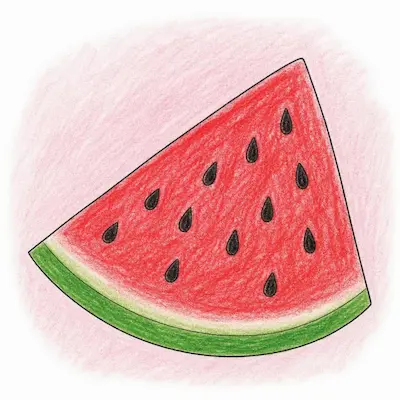
5. Pushing the Contrast on Watermelons
The green rind and the red flesh of a watermelon are exact opposites on the color wheel. This means they naturally make each other look brighter when they sit side by side. I tell my kids to press really hard with the red crayon right near the edge.
If you leave a tiny sliver of white between the pinkish-red and the dark green, it looks exactly like the real thing. Finding good designs that allow for this kind of high-contrast work is rare. It makes the final picture look incredibly punchy. Try blending a little yellow into the green rind, too.
6. Don’t Settle for One Green
Foliage is honestly my favorite part to fill in. But if you color every single leaf the exact same shade of forest green, the picture gets muddy and boring. Mix it up.
Use a bright lime green for the smaller, newer leaves near the top of the stem. Then switch to a deep, dark olive for the larger leaves underneath. Any standard coloring page looks ten times better when the leaves have some actual variation. Dark greens recede while light greens pull forward.
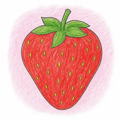
7. Managing the Tiny Details
Things like strawberry seeds or the center of a fig can be infuriating if your markers bleed. This is where a sharp colored pencil is your best friend. Honestly, you can just use a black fineliner to dot the seeds before you even start coloring.
The ink acts as a barrier and makes the tiny details stand out against the red or purple flesh. It might cause some inconvenience if you smudge the wet ink, so let it dry for a second. The end result is totally worth the extra step. Precision is key here.
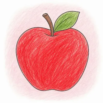
8. Throwing Out the Rulebook
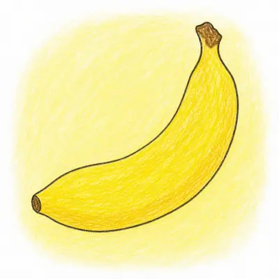
Who says an apple has to be red or green? Sometimes the best way to use these pages is to just go completely abstract. Make a neon blue banana or a hot pink lemon. Let them go crazy with the palette.
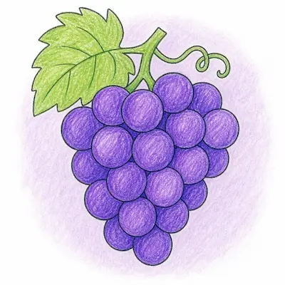
My youngest daughter colored a whole page of grapes in different shades of metallic silver and it looked like alien eggs. It was fantastic. These fruit coloring pages for kids are supposed to be fun, not a strict botanical exam. Just enjoy the process.