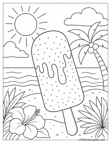
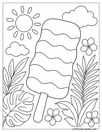
Summer break hit us like a ton of bricks this year. My three kids were bouncing off the walls before June even officially started. I needed something to occupy their sticky little hands without giving them actual sugar.
These popsicle coloring pages were born out of pure desperate necessity. I think they are honestly saving my sanity this week.
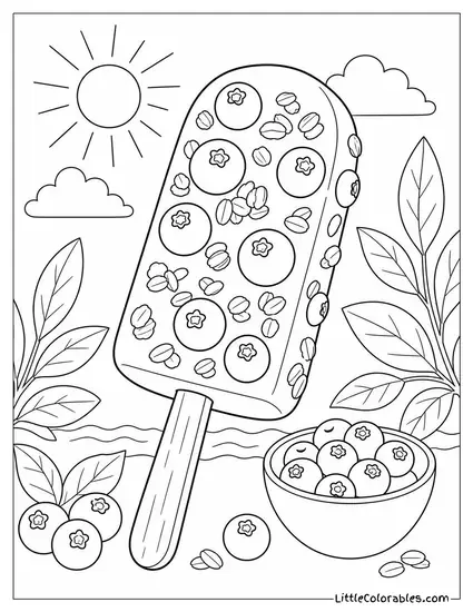
We experimented with so many different backgrounds and toppings because my youngest is obsessed with fruit bars. Figuring out the right mix of summer vibes took a little bit of trial and error.
But seeing them quietly scribbling at the kitchen table makes the effort totally worth it. Grab your crayons and enjoy the rare peace and quiet.
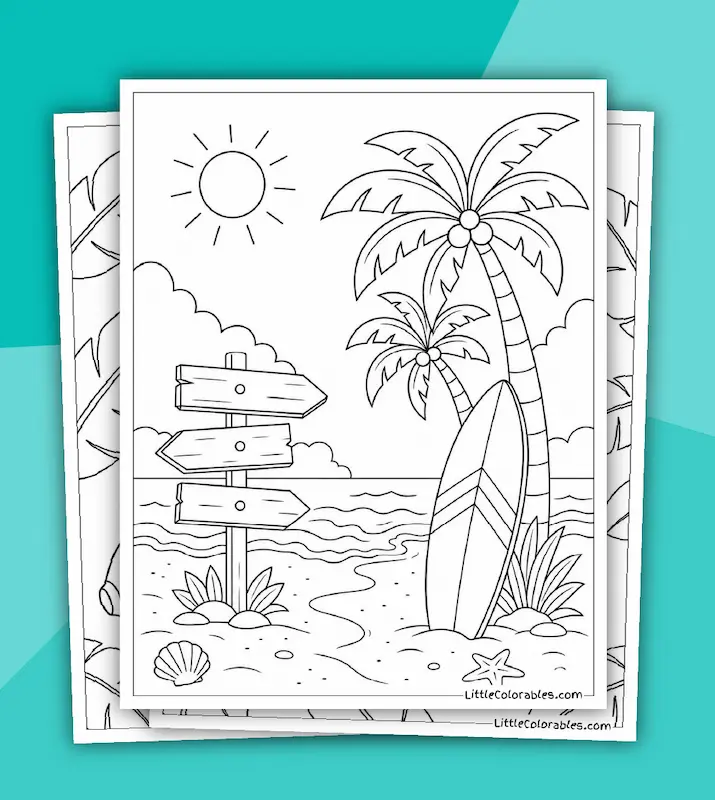
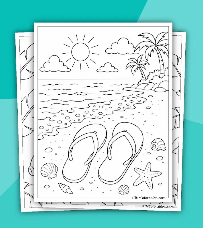
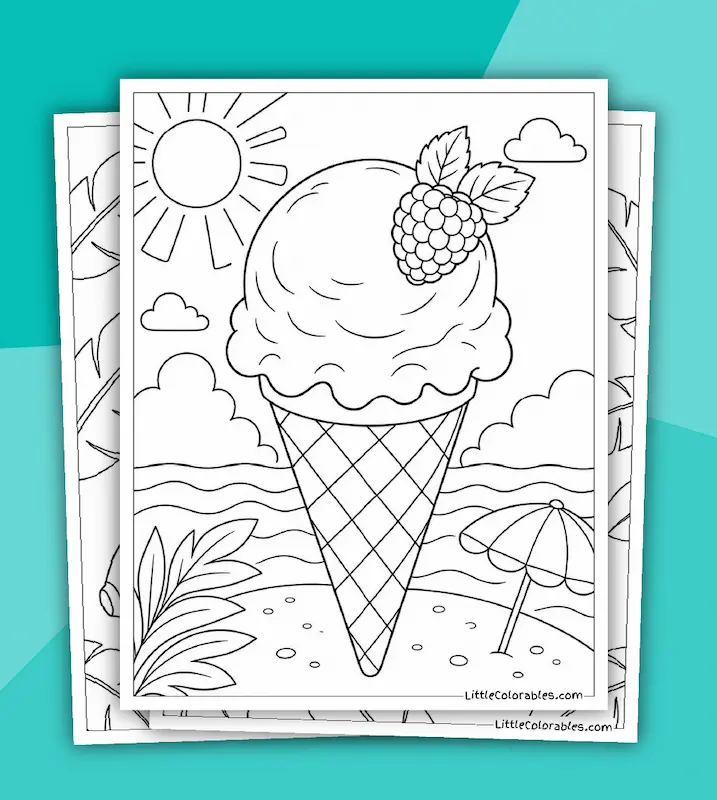
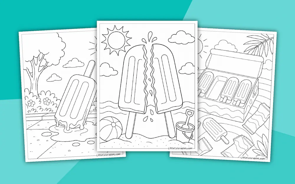
Featured Popsicle Coloring Pages
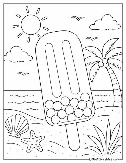
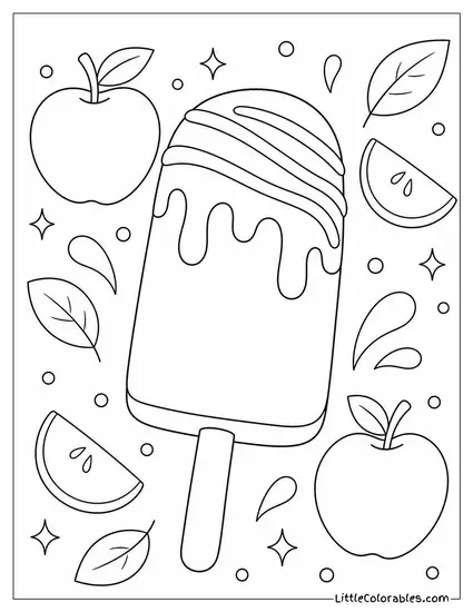
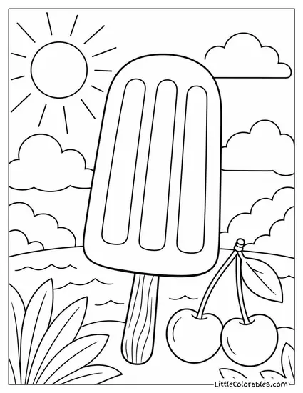
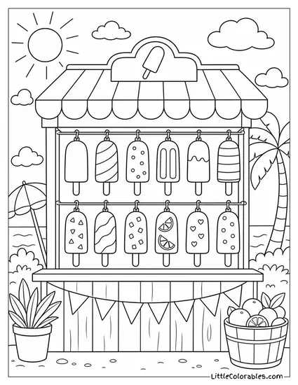

Popsicle Coloring Page Highlights
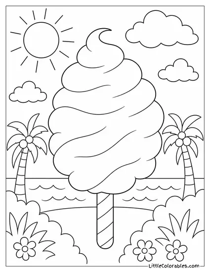
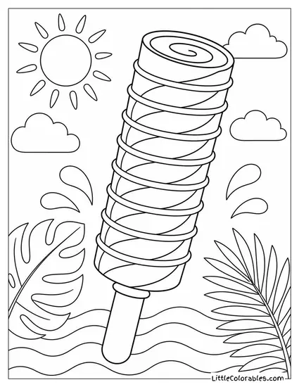
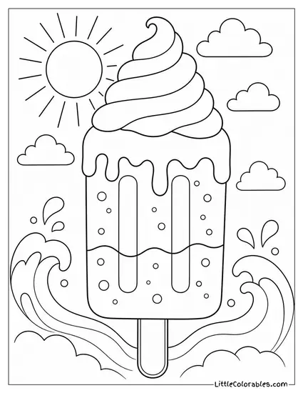
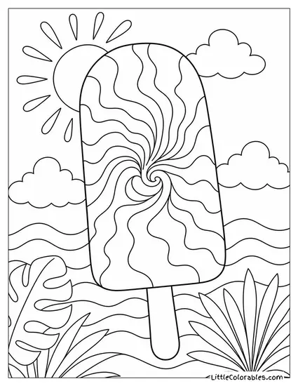
The Fluffy Cotton Candy Swirl
This one honestly looks like a cloud on a stick. It has these big soft swirls that are just begging for pastel colors. The palm trees in the background make it feel like a real beach vacation.
She asked for one of these printable popsicle coloring pages yesterday. She colored the whole thing pink and blue . . . completely ignoring the sand. I guess the heart wants what it wants.
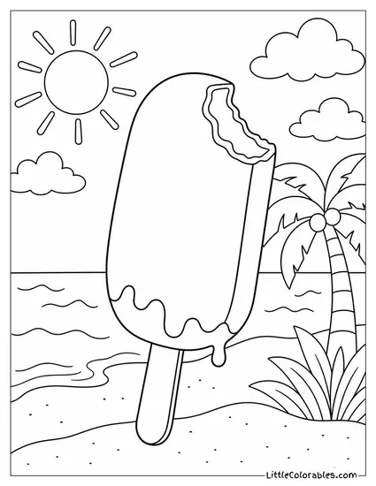
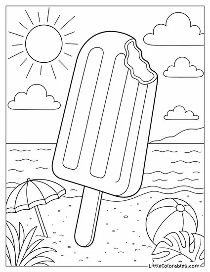
Bitten Creamsicle on the Beach
Someone already took a huge bite out of this one. You can clearly see the creamy center hiding under the top layer. The little beach umbrella behind it is my favorite detail.
It reminds me of the treats the ice cream truck used to sell. We always need a good popsicle coloring sheet for those hot August afternoons. It just feels right.
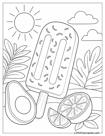
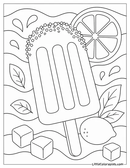
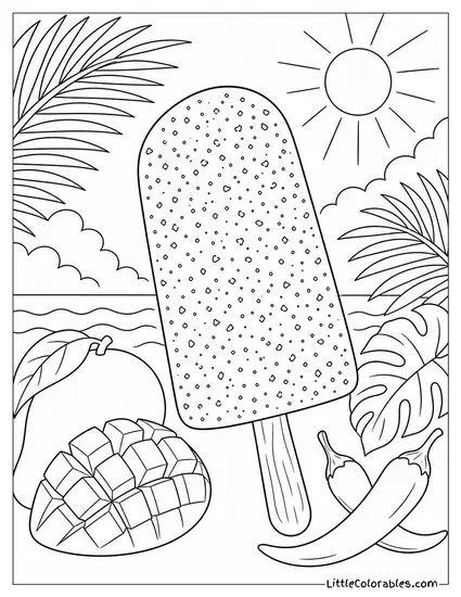
Zesty Avocado with Lime
This decision is maybe not the most obvious. An avocado popsicle sounds totally weird until you actually taste a real one. There are little sprinkles of zest on the ice cream and a huge avocado half sitting right there.
I had to explain to my oldest what zest actually is. These free popsicle coloring pages sometimes turn into accidental vocabulary lessons. Who knew coloring could be educational.
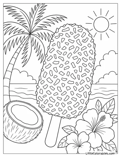
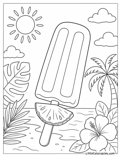
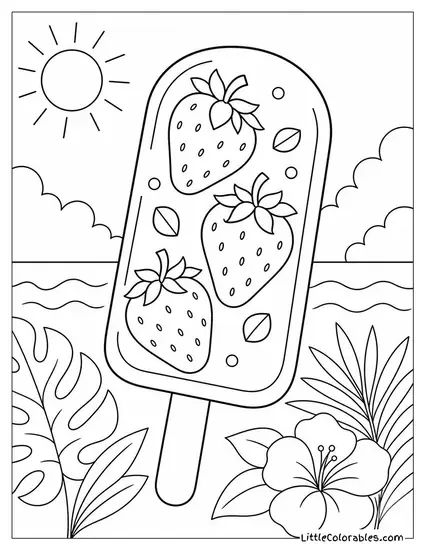
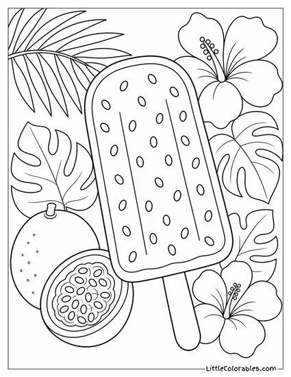
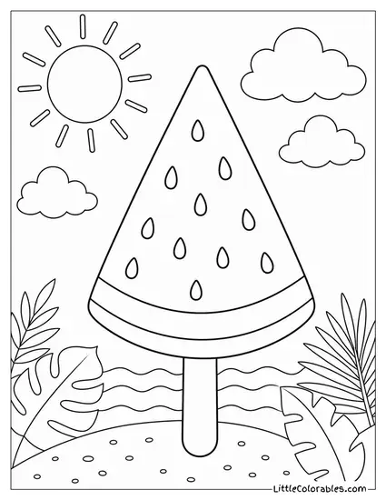
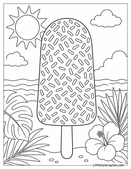
Tropical Pineapple Slice
There is a massive wedge of pineapple sitting right on the stick. It looks incredibly refreshing. The big hibiscus flower next to it screams summer vacation.
Kids usually go straight for the bright yellow crayons here. If you want a fun activity you should print this popsicle coloring sheet out. It keeps them busy for at least 15 minutes.
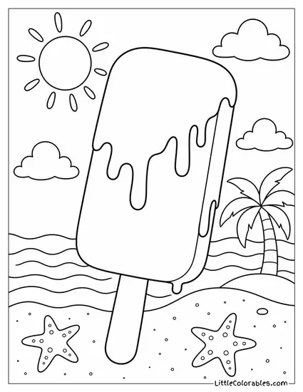
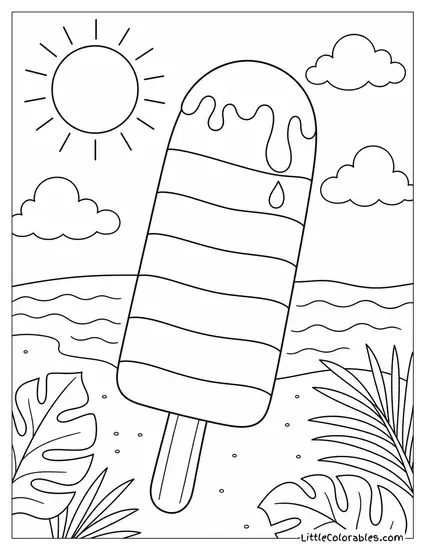
Dripping Chocolate Fudge Bar
This thick bar is melting fast under the hot sun. You can see the thick drips running down the sides. And there are tiny starfish chilling in the sand right below it.
It makes me crave actual chocolate every single time I look at it. Finding solid popsicle coloring pages for kids isn’t always easy. But this one hits the spot.
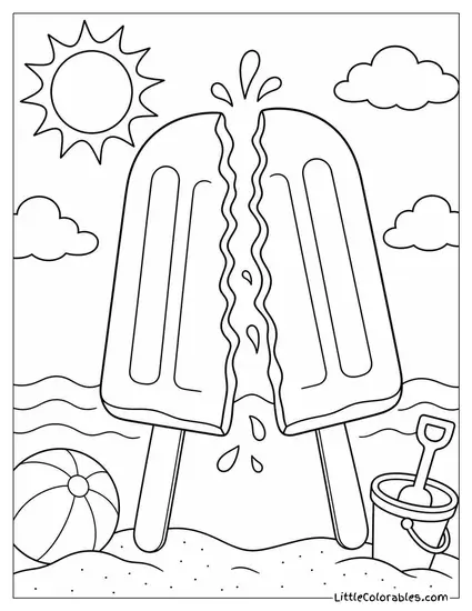
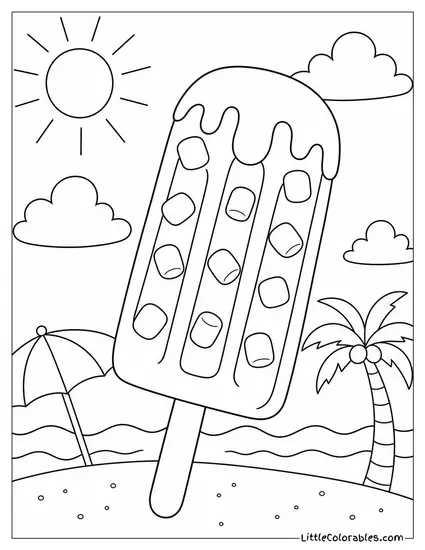
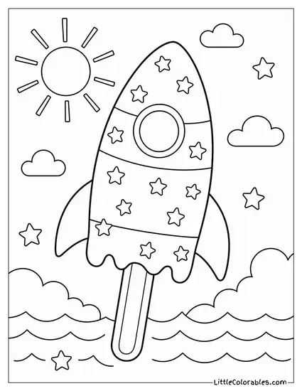
The Giant Novelty Pop
This is your classic three ridge design. But we made it absolutely massive compared to the tiny shells on the beach. It is basically the Godzilla of frozen treats.
It might cause some inconvenience if you actually tried to eat something this big. I print these free popsicle coloring pages when we have playdates. The kids always argue over who gets to color the giant one.
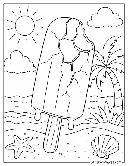
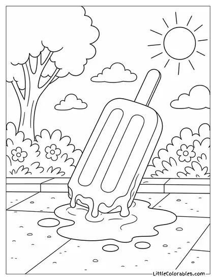
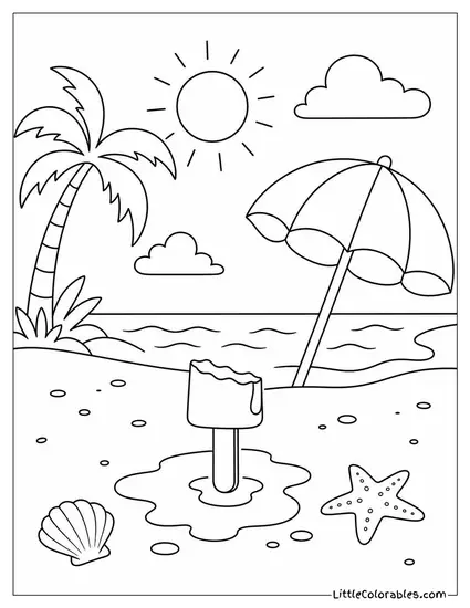
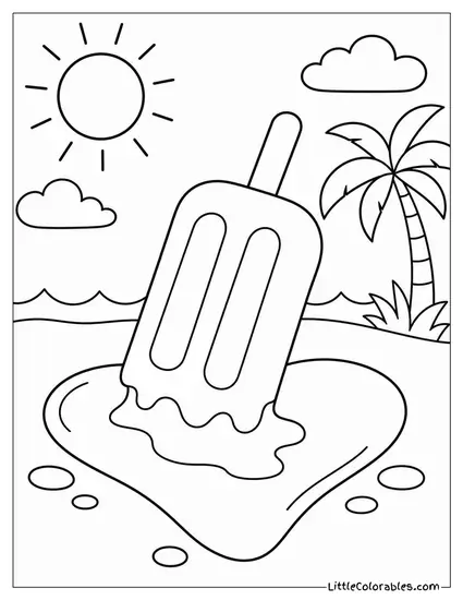
The Fallen Sidewalk Puddle
Absolute tragedy struck right here on the hot pavement. The popsicle fell right off the stick and is melting into a huge puddle. You can even see the sidewalk cracks.
Every parent knows the exact scream that follows a dropped treat. I like having some printable popsicle coloring pages that show real life stuff. It is messy and kind of funny.
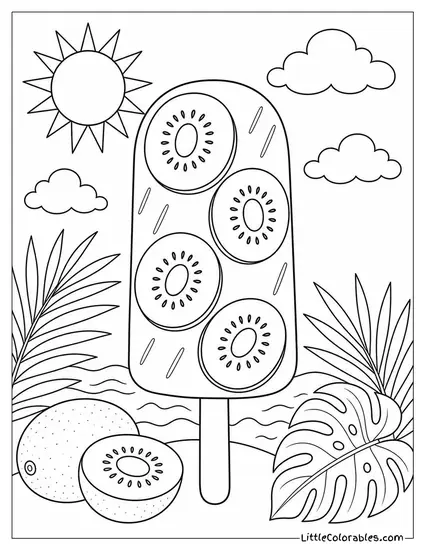
Frozen Kiwi Slices
We put four distinct kiwi rounds right inside the icy part. It looks super refreshing. There are even more kiwi halves lying on the tropical leaves nearby.
Getting kids to eat real fruit is a daily battle. Maybe these popsicle coloring pages for kids will brainwash them into liking kiwis. A mom can dream.
Tips for Coloring Popsicles
1. The Melted Puddle Effect
Kids always want to color a puddle just one solid flat color. But melting ice is actually quite complex. It has shadows and lighter wet spots.
Tell them to press hard with their crayon near the center of the puddle. Then use a lighter touch as they move outward to the dry sidewalk. It makes the sticky mess look way more realistic.
2. Sand That Actually Looks Like Sand
Most of our backgrounds have a lot of beach sand. If they just use the standard yellow it ends up looking like a weird desert. Or a block of cheese.
We usually mix a tiny bit of light brown or orange into the yellow. Just gently rub a brown colored pencil over the top. It adds that gritty texture you expect at the beach.
3. Making the Chocolate Look Thick
The fudge bar needs to look rich and heavy. Thin markers sometimes leave streaks that ruin the illusion. You need something solid.
Crayons are honestly better for the thick chocolate coating. Have them go over the dark brown spots twice. It builds up a waxy layer that almost looks good enough to eat.
4. Pastel Clouds for Cotton Candy
Cotton candy colors are super specific. A harsh neon pink totally ruins the fluffy vibe we were going for. You want soft and airy.
If you only have bright markers just color very lightly. Or better yet switch to chalk pastels if you dare to handle the dust. The mess is terrible but the blending is incredible.
5. Giving Fruit Some Life
The kiwi slices and pineapple wedges need to pop. Fruit in real life isn’t perfectly uniform in color. It has highlights and darker spots near the seeds.
I show my kids how to leave a tiny white spot uncolored near the top. It looks like the sun is shining directly on the wet fruit. They think it is some kind of magic trick.
6. Managing the Wooden Stick
The wooden popsicle stick is the anchor of the whole picture. Kids usually ignore it or color it black. That just looks strange.
A light tan or beige marker works perfectly here. If you want to get fancy draw a few faint lines down the middle for wood grain. It grounds the whole abstraction into physical reality.
7. Highlighting the Zest
Those tiny little zest flecks on the avocado pop are tricky. If you use a fat marker you will just blob over them. They get completely lost.
Grab a sharp fine tip pen or a nicely sharpened colored pencil. A bright neon green works great to make the lime zest stand out against the paler avocado color. It is a detail worth saving.
8. Water and Waves
The ocean backgrounds need some depth. Water is never just one single shade of blue. It changes depending on how deep it is.
We use dark blue for the water way out by the horizon. Then we transition to a lighter aqua closer to the sandy beach. It is around 3 different shades usually.